Technical Skills
×


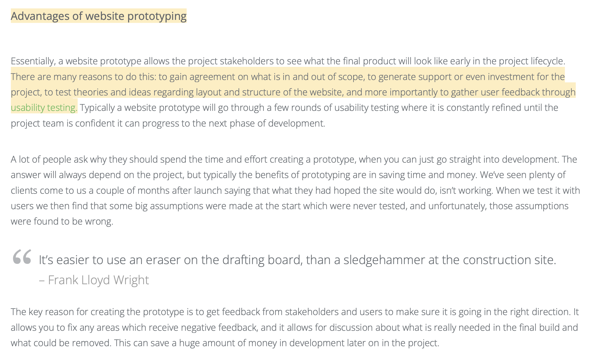
Trends and developments:Learning Outcome
You have studied the various developments in the area of digital experience design. You have formed an opinion about it. Based on this you justify your choice of study direction in this domain.
Action
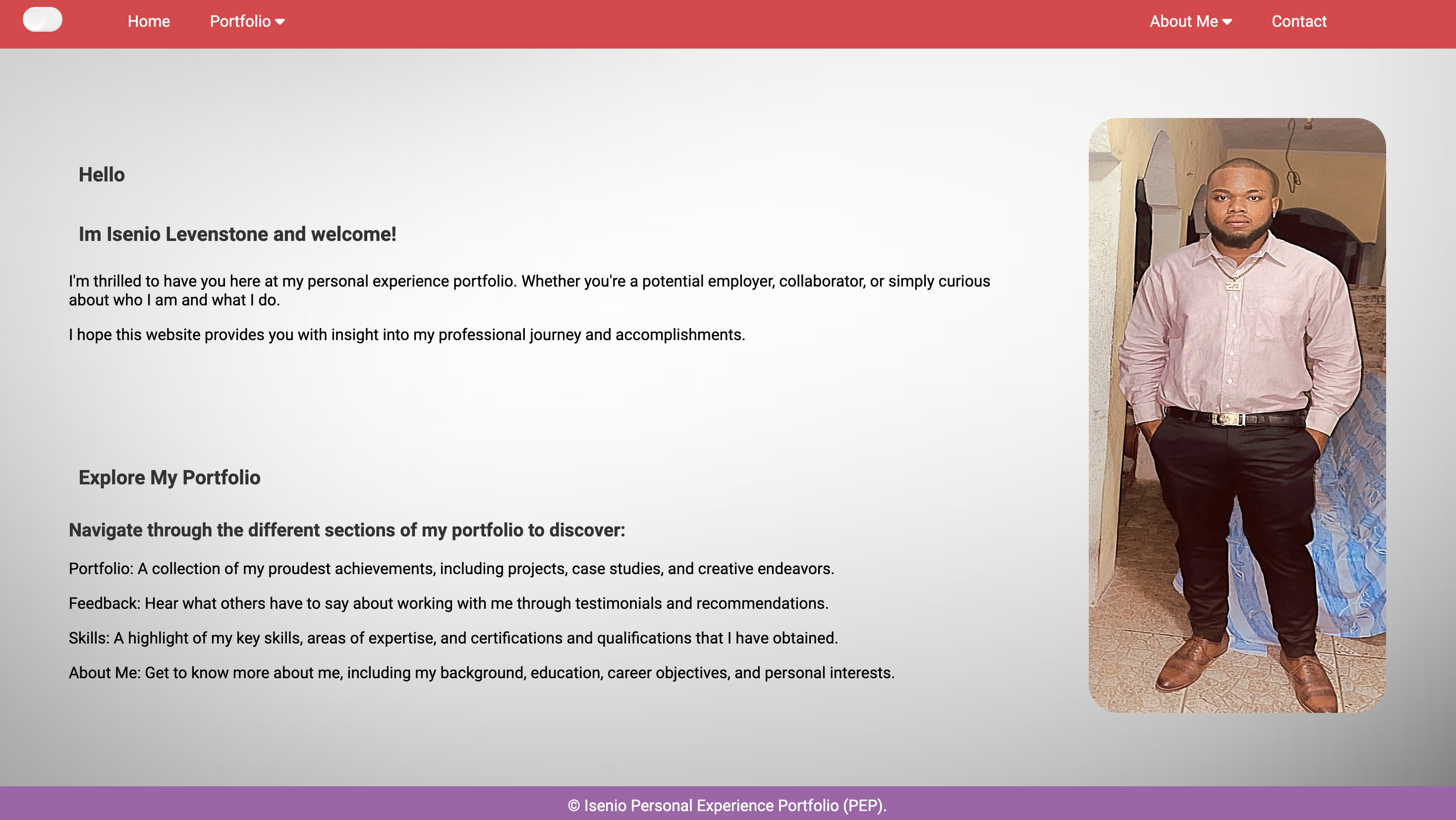
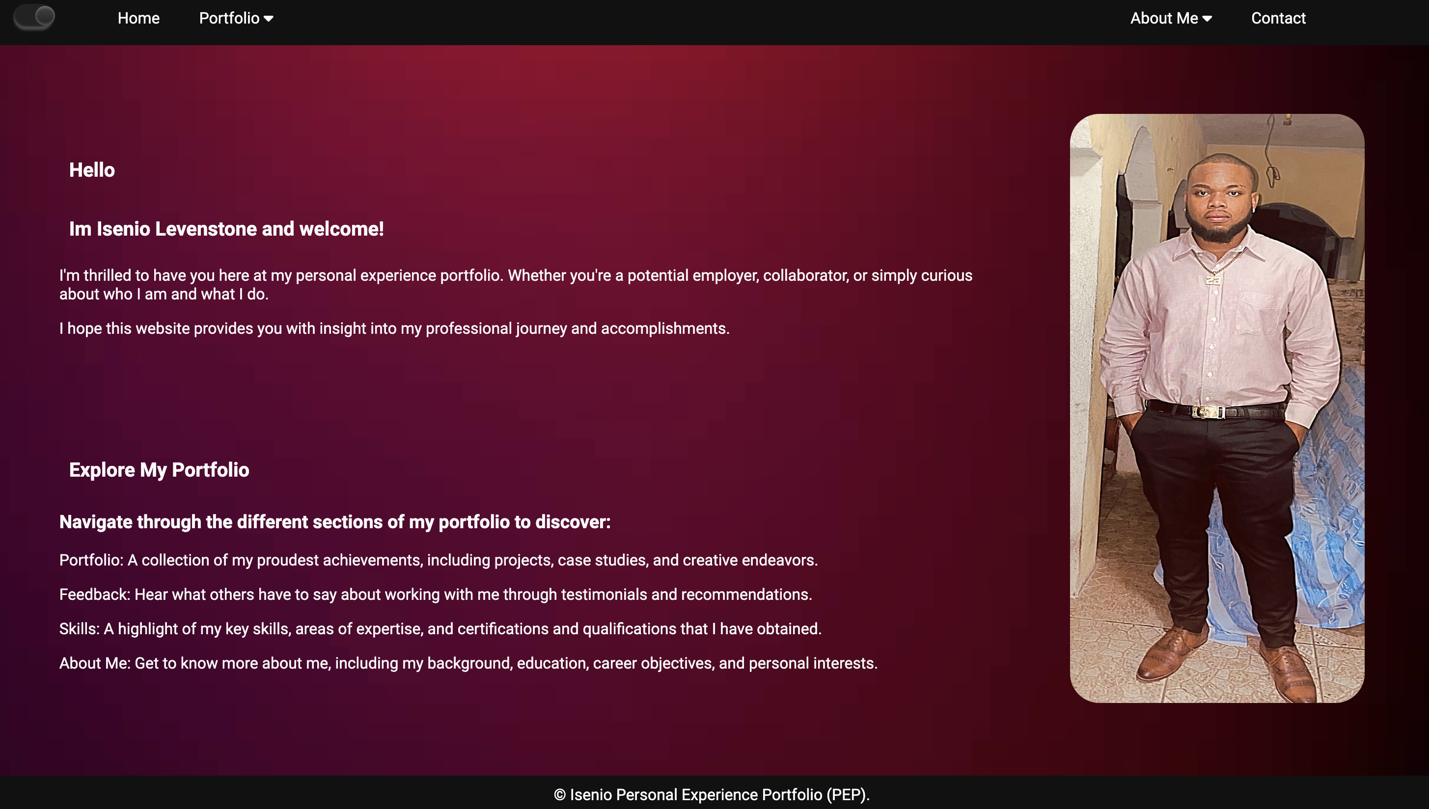
In my personal portfolio, I conducted comprehensive research on the latest trends and technologies in digital experience design. This included how to implement a light and dark mode in my portfolio, how to create a functional forums page, and how to use google fonts.
Feedback
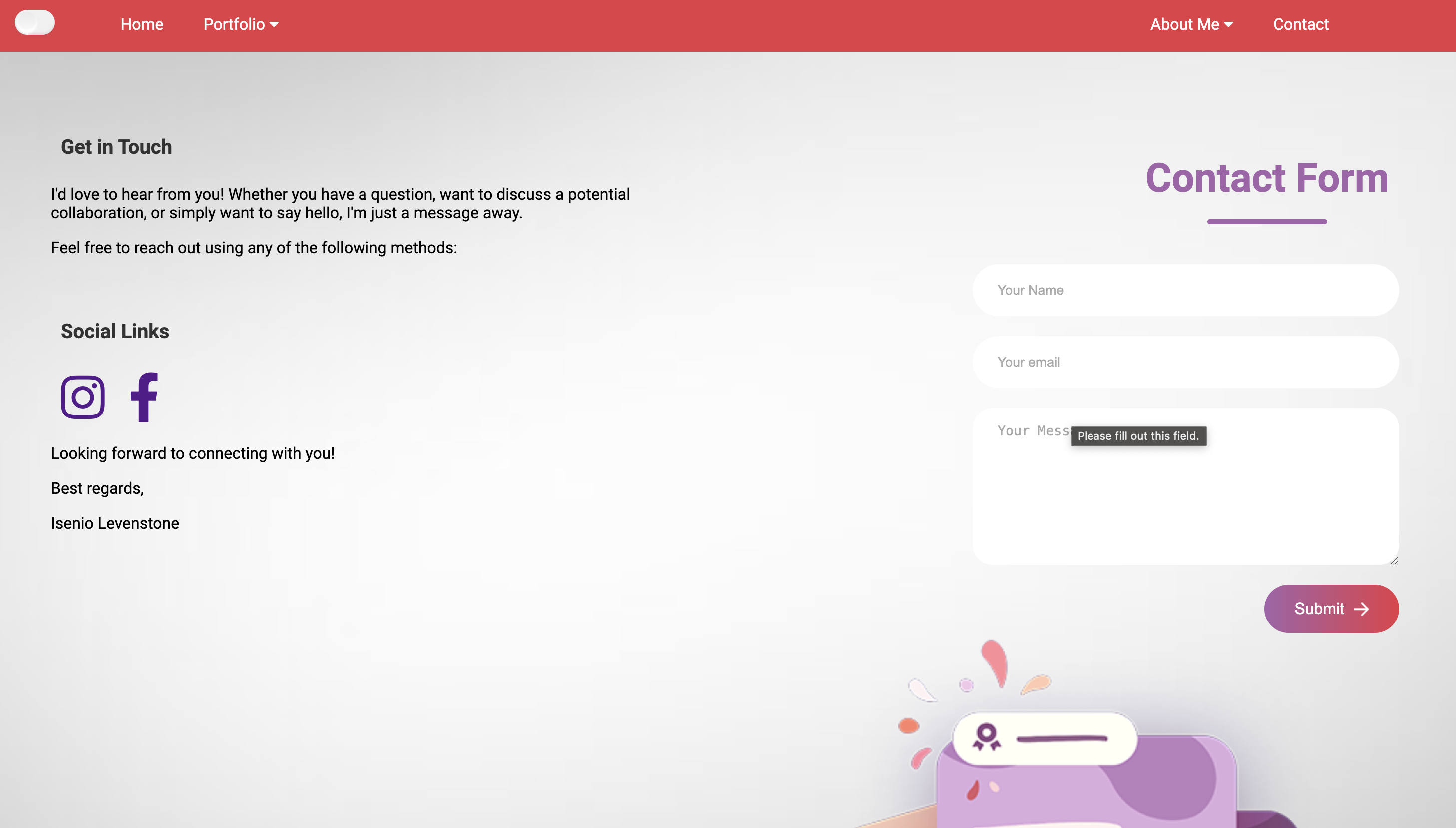
Feeback from my peers. They said that the light and dark mode feature was a welcome addition but suggested improving the transition animation for a smoother user experience. When the button was pressed it took a couple seconds longer to switch modes. They also mentioned that the forums page was functional but could benefit more if I actually created a forums page instead of having links and a phone number. My teachers stated that it is nice to use Google Fonts butthat I should implement it locally. They also highlighted the need for consistent design elements across both light and dark modes.
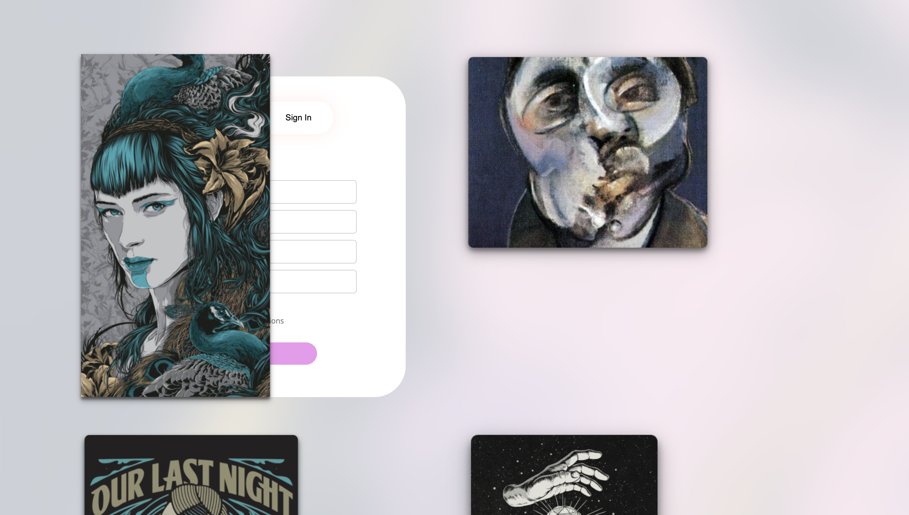
Before
Before
Light Mode Before
Reflection
Reflecting on the feedback, I realized the following: Light and Dark Mode: While the implementation was successful, I could improve the transition time when the button is pressed so theat the mode changes right away. Forums Page: Although functional, the layout could be improved where users can contact me through the actual website. Google Fonts: Using Google Fonts locally will improve performance and is safer. This reflection helped me see the importance of not just implementing new features but also providing overall better website.
Decision
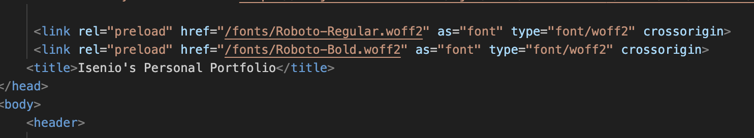
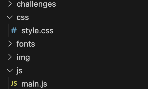
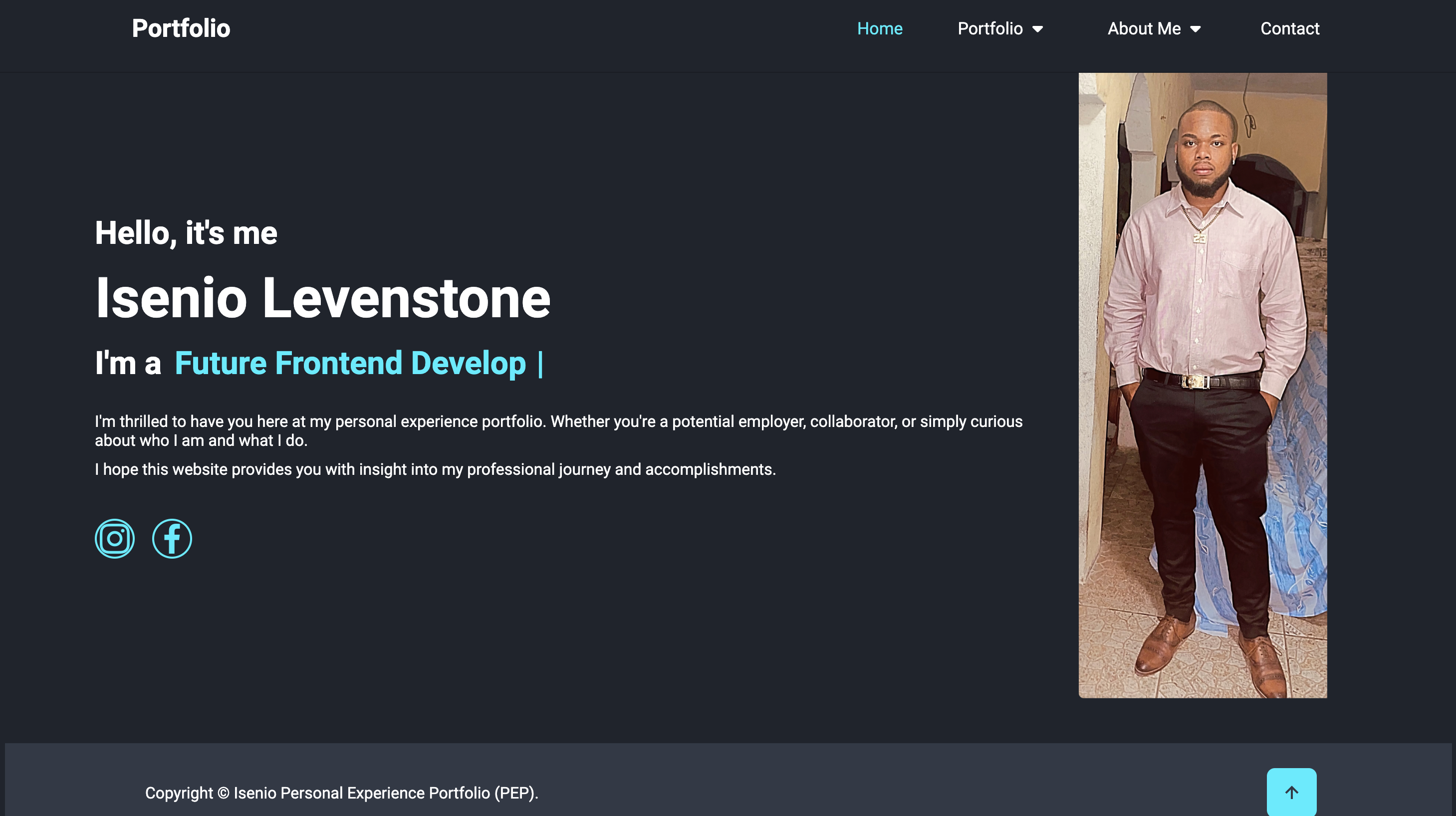
Based on my research and the feedback received, I made the following decisions: Enhancing Light and Dark Mode: I decided to improve the transition animation across both modes so as soon as the button was pressed, it switches modes. Improving the Forums Page:I made an actual forums and gave it functionality to increase user engagement and make the forums more interactive so that when it filled in it comes to my email. Optimizing Google Fonts: I refrained from using linking google fonts anymore and downloaded it locally to my repository. Then linked it through my local repository. This will ensure fast loading times for the fonts used in my portfolio and also ensure no sudden loss of font style. These decisions helped me create a more polished, user-friendly, and accessible portfolio.
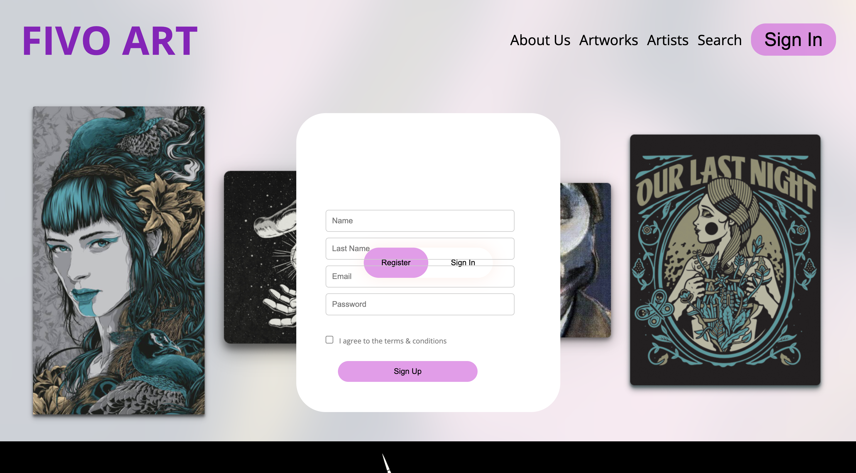
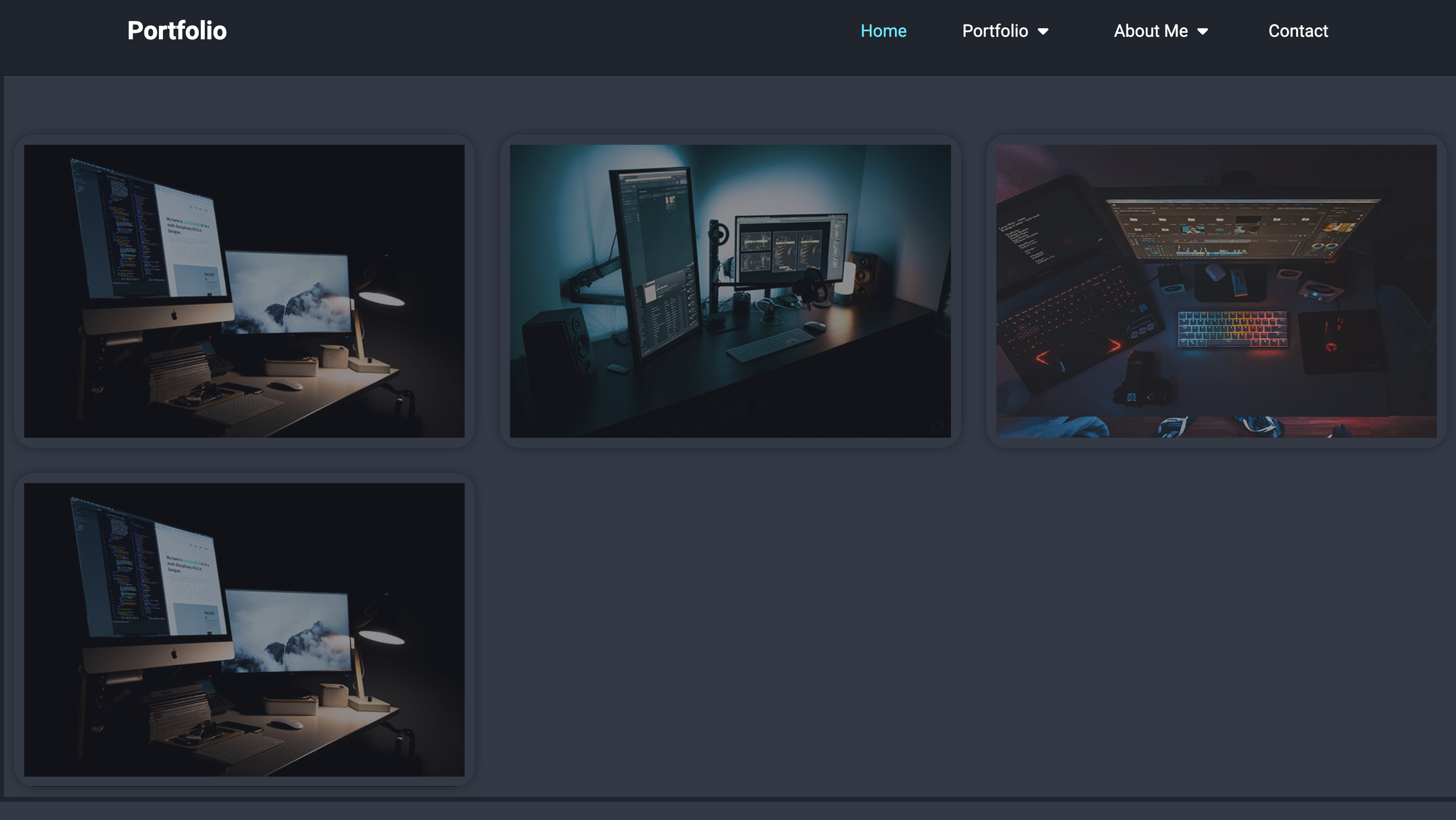
After
After
Light Mode After
Example 2
Trends and developments:Learning Outcome
You have studied the various developments in the area of digital experience design. You have formed an opinion about it. Based on this you justify your choice of study direction in this domain.
Action
For, the group project I had do research on flex and how to place items with flex as I am not best with it. In the group project I was responsible for creating the signup, login page and newsletter page.
Feedback
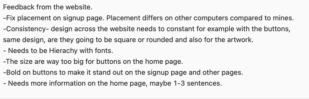
Feedback from my teacher I needed to fix the placement on the signup page as it would show good on my screen but when it was showed on other screens, the pictures would overlap the signin form. The overall signin form position and design was good. Also needed to fix placement issues on the newsletter page as it didnt match the placement on the prototype. Feeback from my group members was that I also neeeded to fix the placement issues on the sign in page as well as they were seeing the same issue as well because of our different screen sizes.
Reflection
From the feedback, I realized that I had to fix the posistioning issues, this issue occured because I was using absolute position so the images had no room to move when it changed to different creen sizes so it would stay in the same place. I also changed the signup form to look abit different from the one on the prototype because I found that it was too dry and plain so I went with a design that I found best for the form along with my teammates approval. You can see below and the way it changed under the decison heading.
Decision
Based on the feedback and my reflection, I fixed the positing for the images using flex instead of absolute positing. This fixed the different screen isssues as a flex containers allows its properties to grow within the container. Also fixed the positing on newsletter using one big flex container and making several properties inside of it. I also changed the look of the sign uo from to make it look more attracting.
×

Iterative Process:Learning Outcome
You show iterations in the work process and you explain how feedback from users and experts has contributed to your design choices. Your design meets the needs of the end user and is aesthetically justified.
Action
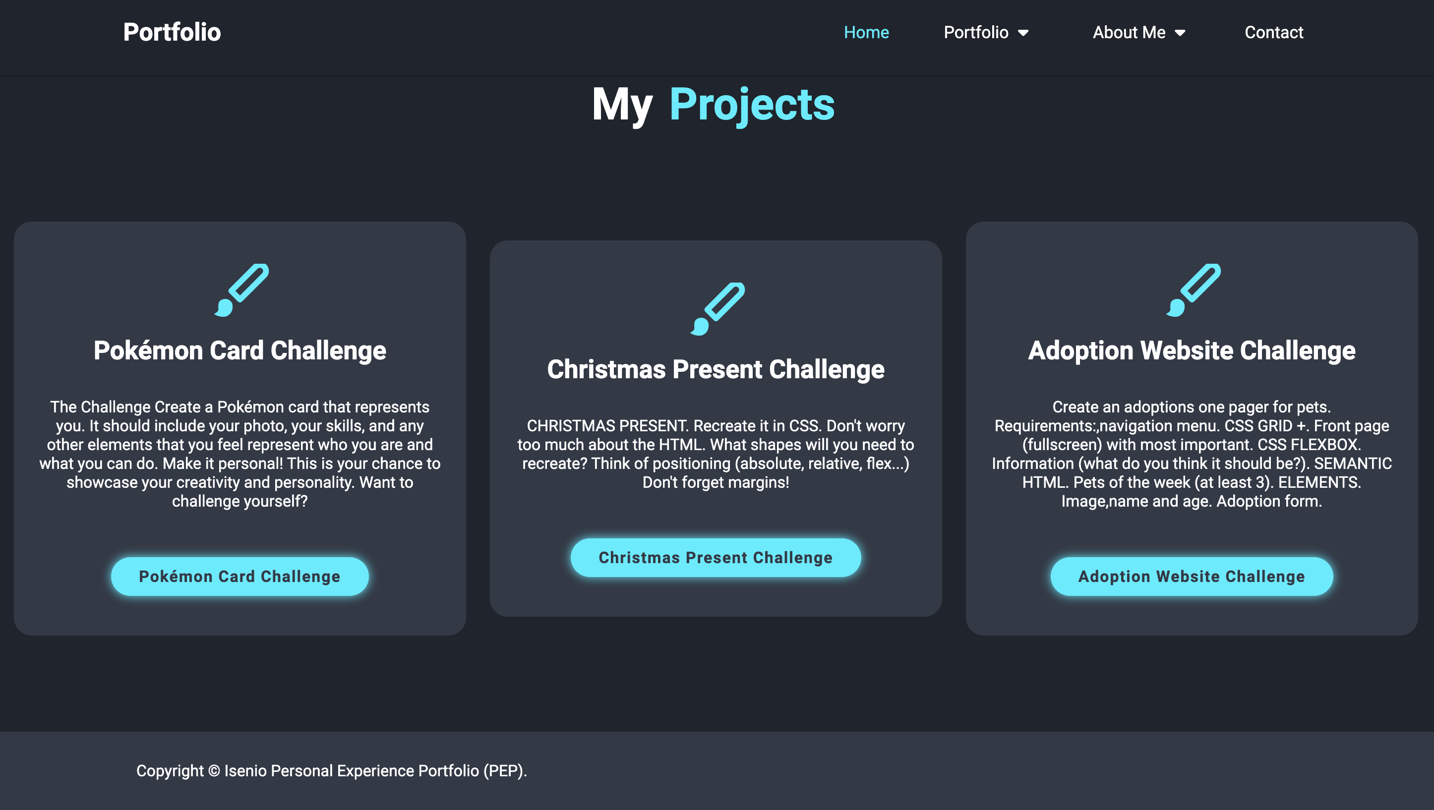
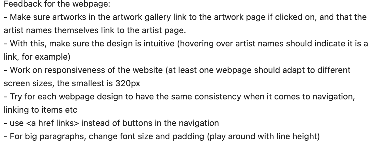
I updated my portfolio to include a new forums page and made initial designs for the project pages. I also incorporated a contact page with a unique design featuring various shapes.
Feedback
Peer Feedback: Some users mentioned that the project pages felt too empty and lacked sufficient content. Teacher Feedback: suggested using subheadings and bullet points for better readability, adding left and right margins to paragraphs, and maintaining design consistency across all pages. Additionally, they advised caution with using red in the nav bar as it could be perceived as a warning color. They also recommended including before-and-after screenshots to illustrate changes based on feedback.
Reflections
Reflecting on this feedback, I recognized the importance of filling the project pages with more detailed content to make them more informative and engaging. I also saw the value in making the text more readable and ensuring consistency in design elements across all pages. The advice about the color red in the nav bar made me consider how color choices impact user perception. Finally, I realized that documenting changes with screenshots could effectively communicate the evolution of my design.
Decision
Based on the feedback and my reflection, I made several decisions: Content Enhancement: I added more detailed descriptions and visuals to the project pages to make them more engaging. Readability Improvements: I reformatted the documentation with subheadings and appropriate margins to improve readability. Color Adjustment: I experimented with different colors for the nav bar and footer, opting for a more inviting palette instead of red. Documentation of Changes: I included before-and-after screenshots in my portfolio to clearly show the impact of feedback on my design choices.
Example 2
Iterative Process:Learning Outcome
You show iterations in the work process and you explain how feedback from users and experts has contributed to your design choices. Your design meets the needs of the end user and is aesthetically justified.
Action
I changed the design of my portfolio based on feedback given from the teachers and also changed the organisation of my portfolio.
Feedback
Feedback received from the teacher was that the design wasn't doing it, it was very plain and not attracting even tho I had a light and dark mode theme in there. There was also no consistency and organization. The teacher then advised me to look at more inspiration to come up with a new better looking design.
Reflections
Reflecting on this feedback, I recognized that the teacher was right. My portfolio looked very plain and dull. I also watched some portfolios from others also, I felt like dam my portfolio really is shit compared to the rest. It really made me, think dam, I can do better if I put more time and effort into it. Also I realized that the reason my design was so bad was because I did not make an interatcive prototype. That hindered the whole process of my portfolio and if I had done that, it would of make my life so much easier cause I could edit the design instead of changing the code everytime to find a design.
Decision
Based on the feedback and my reflection, I made decision to seek inspiration and sort out and made a new design. I went with a completely dark themed website and some add some animations colors and different style text to make it attracting. I also vowed for the next time to always start with a protoype and not coding first. This is the rule I have vowed to folow for the next semeseter. I have learned my lesson now of repetitive the process of coding is when you dont create a protoype.
×


Interactive prototypes:Learning Outcome
You make digital products that create a specific, purposeful interaction between human and machine. As input for this you have made sketches, wireframes and prototypes. You use structure and style languages e.g. HTML and CSS
Action
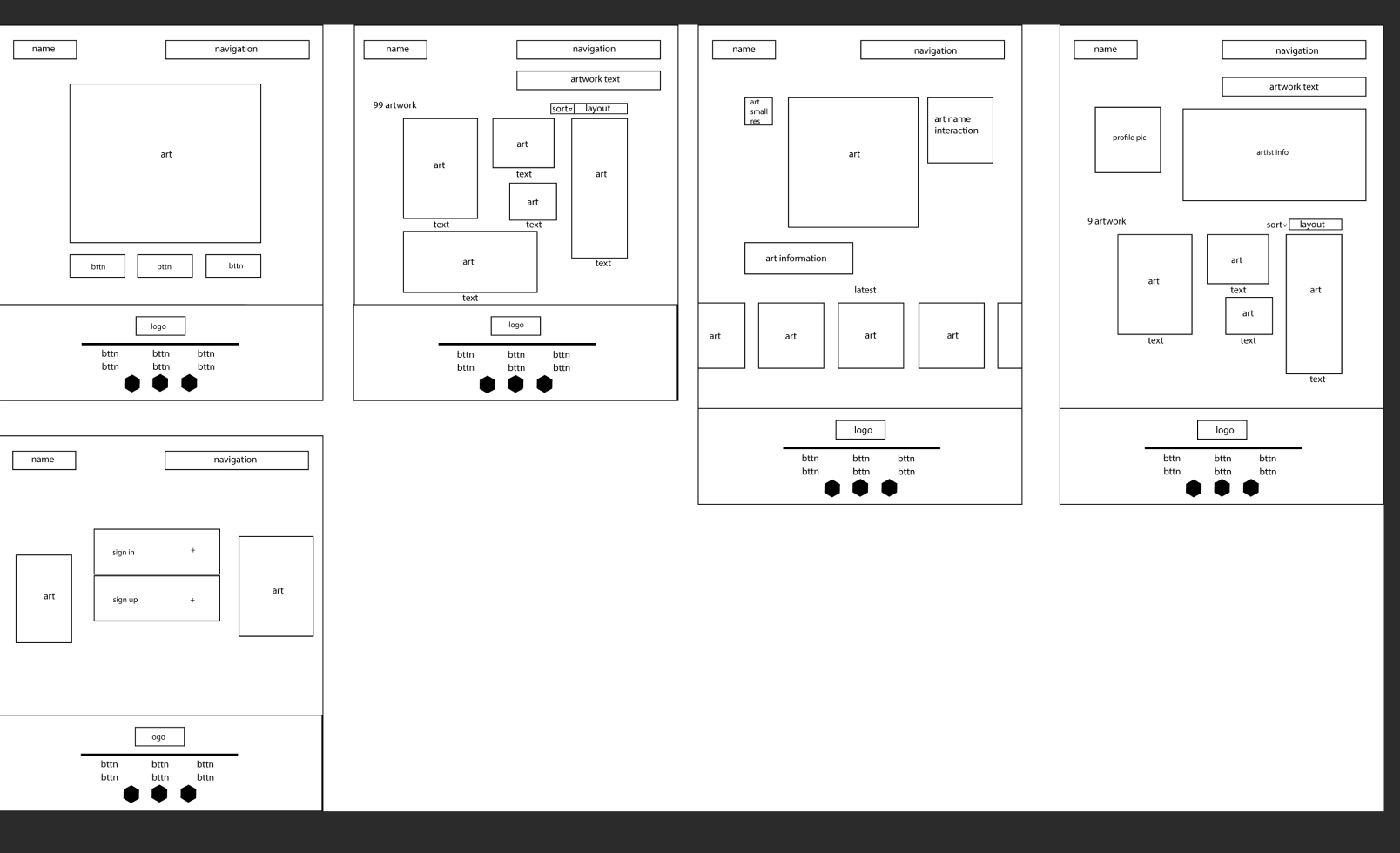
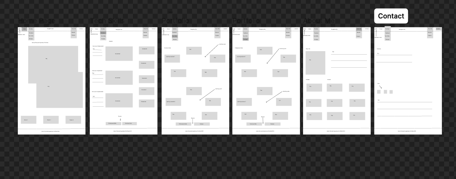
I created wireframe, personas and logos for the group. I designed these digital products with clear goals in mind, ensuring that what the users might think and want to see that is appealing. Hence why I created a persona. By doing this, it helps me iterate and refine the product design based on feedback.
Feedback
Feedback from peers: they loved the persona so we used this persona to conduct research for our art website. They also like the logos's but I found it myself to be to much happing in one picture. Wirefram was clear and everybody could understand and get the layout of the website.
Reflection
Reflecting on the feedback, the persona's were deemed good but I found that more personas should have been created for more points of views and perspective. On the logos, I found that they were ok but they are not deemed fit to go with the color schem of the art website.
Decision
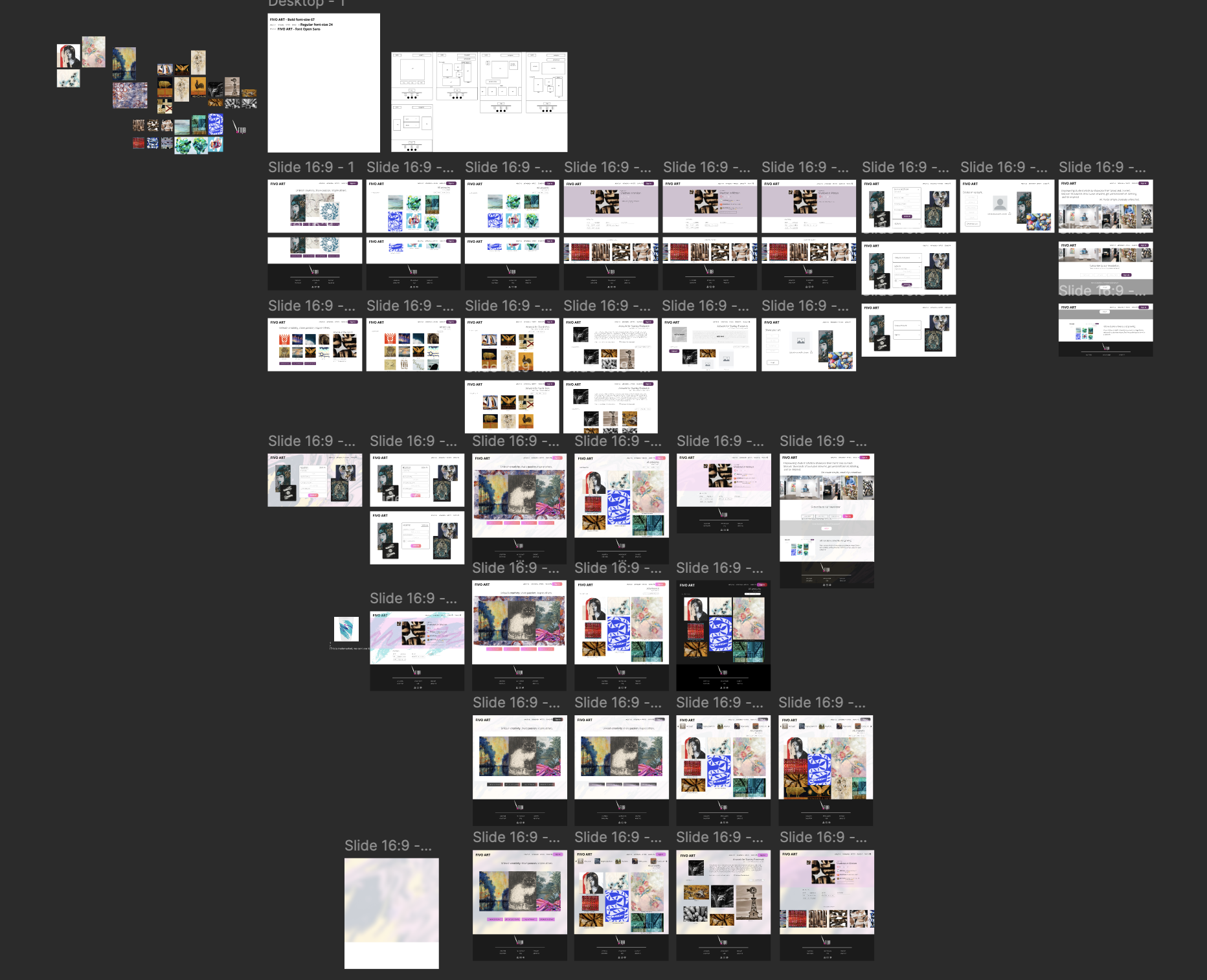
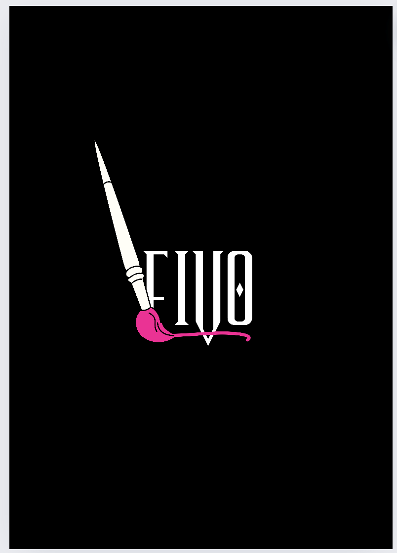
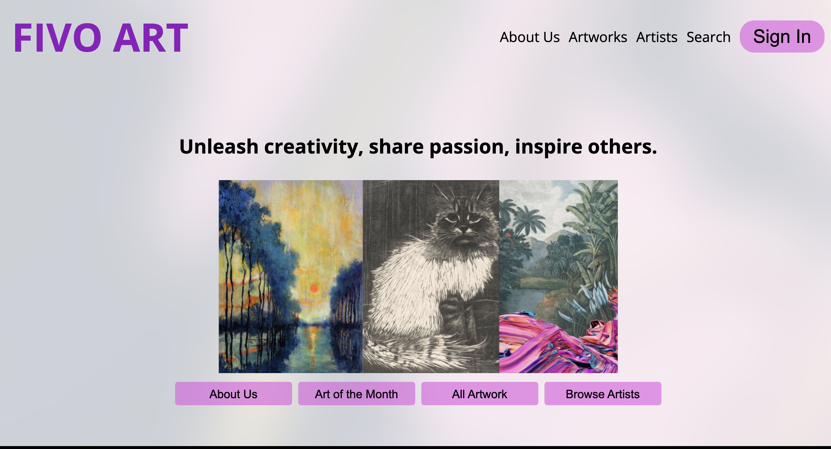
Decided to use the persona to our advantage for building the website. Also choose not to go with the logo's I created and decided to go with a more simple and clean logo. This logo is simple and clean doesnt have nothing much going and doesnt distract the audience.
Example 2
Interactive prototypes:Learning Outcome
You make digital products that create a specific, purposeful interaction between human and machine. As input for this you have made sketches, wireframes and prototypes. You use structure and style languages e.g. HTML and CSS
Action
I created one wireframe for personal portfolio website and did not create a interactive protype.
Feedback
Feeback I received is that the wireframne is quite confusing and should reedit it again to be much clearer. Feedback I also received, that making interative prototype is easier to change the design in figma then it is to change in the coding. By doing this it easier to see the design that you are going for and you don't have to change the code as much.
Reflection
Reflecting on the feedback,I have realized that making a protoype is easier then what I am doing changing the code everytime is just redundant and repitive. When you change the design in the figma,you automatically see how it it is going to look and can make the necessary changes. I always taught that prototyping was a waste times all these semesters, and that it just takes up unnecessary time but I have come to realize that it is not.
Decision
Decided for next time, to start with prototypes and dont imediateley satrt coding. I should do some protoytpes first, get user feedback and testing than start to implement the coding when the prototypes have been finalized and finished. I also decided that I should make this a habit, I should revert back to the protype and make changes there as well to see,document progress and changes.
×
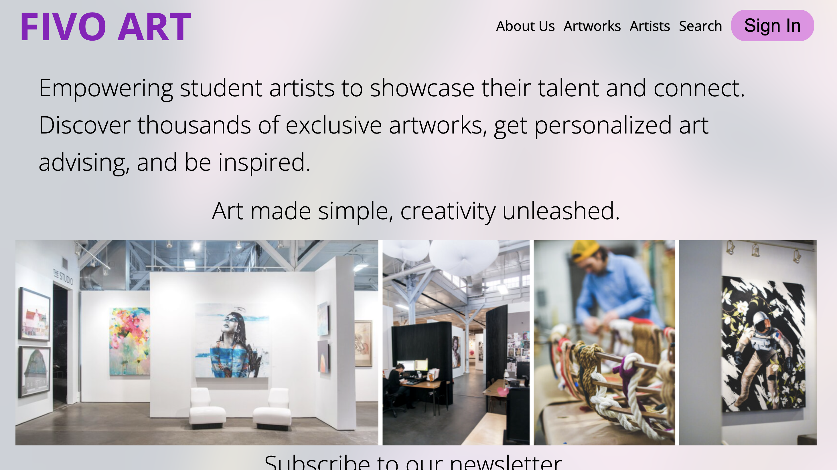
Target Group:Learning Outcome
During the developmental process you take the interests and needs of the end user into account.
Action
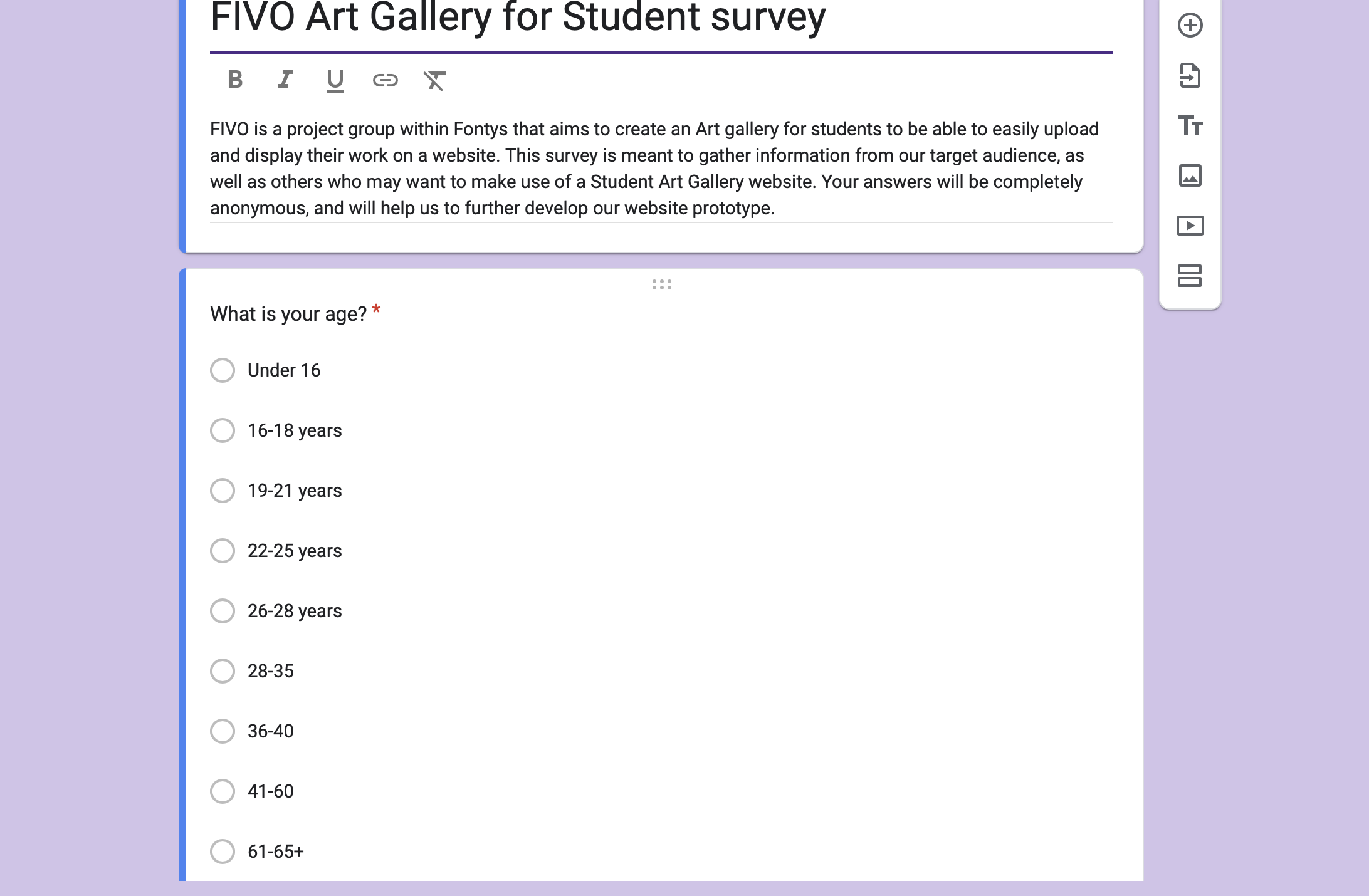
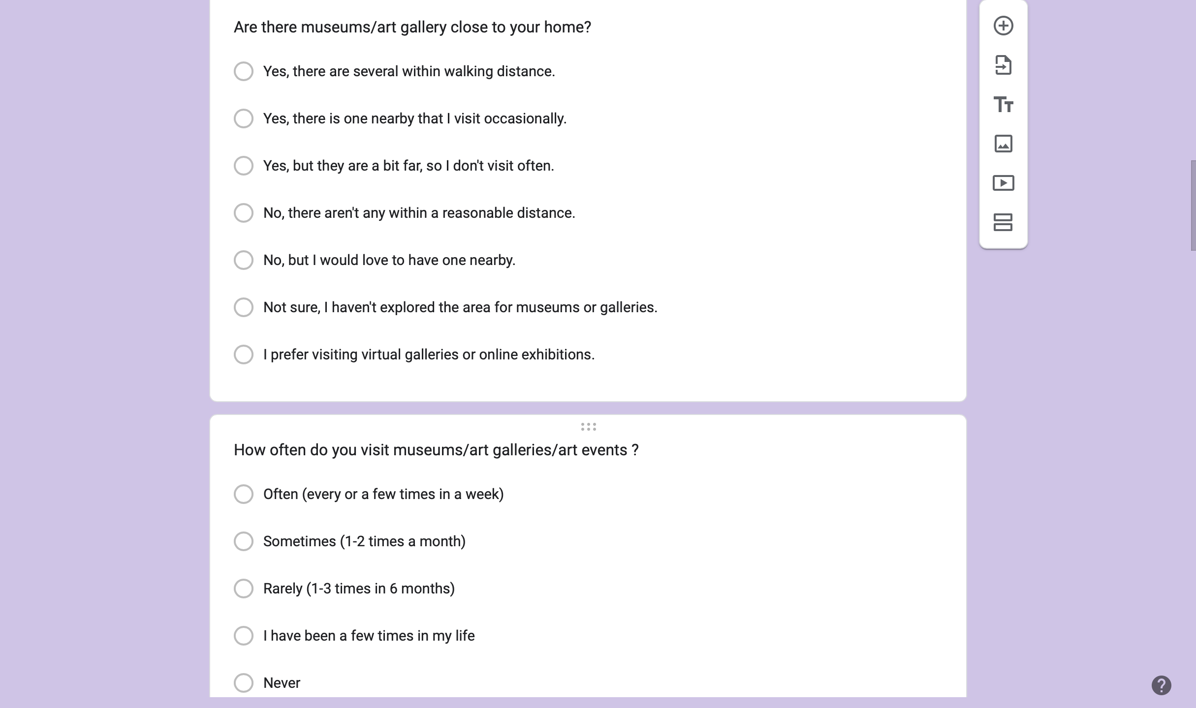
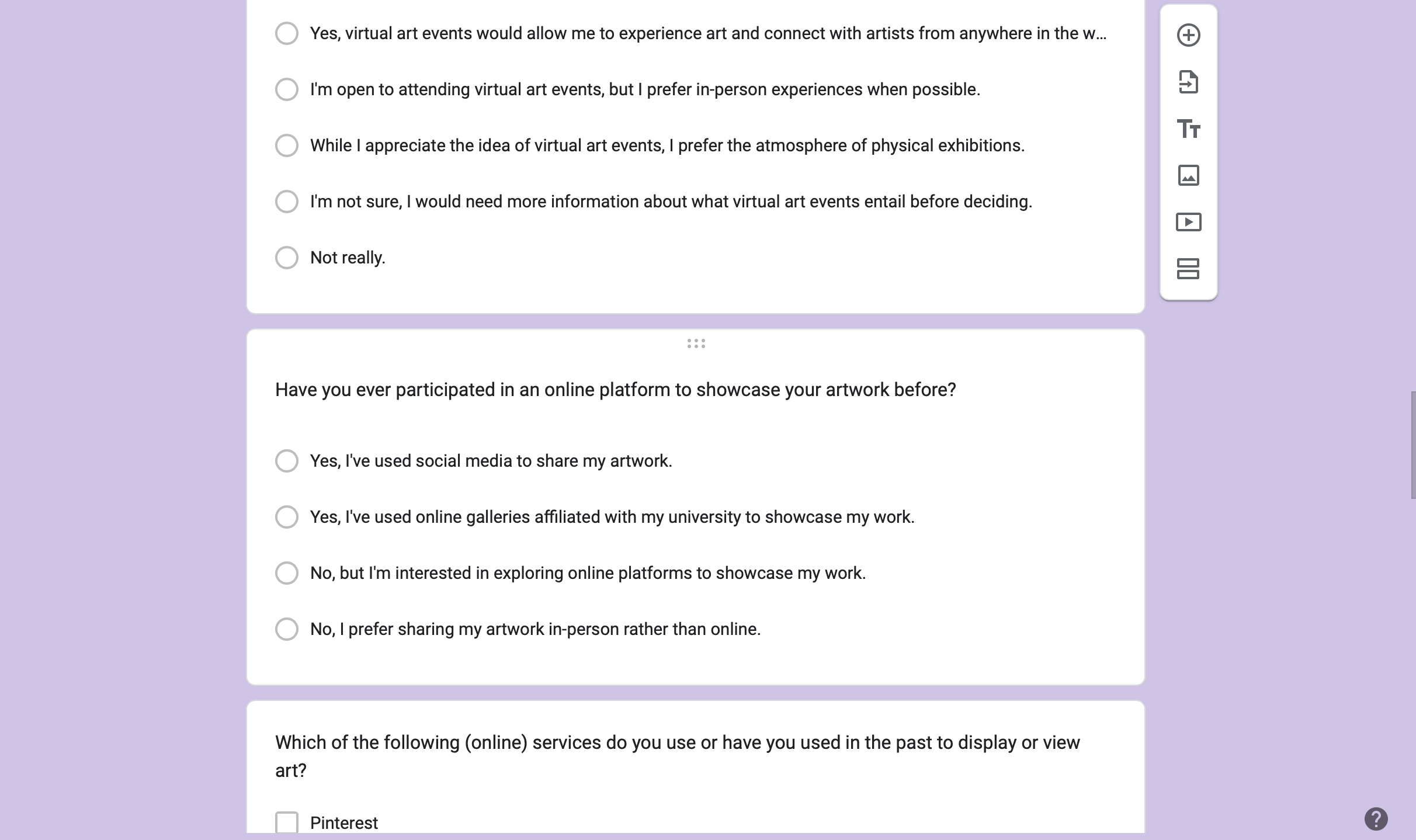
The project team distributed online surveys to Fontys students, asking about their favorite art styles, preferred gallery features, and any accessibility requirements. Based on this information, the team created initial sketches and digital renderings of the proposed gallery.
Feedback
The team invited some students to review the digital prototypes of the gallery and also showed the teachers. During these sessions, students and teachers provided feedback on the layout, suggested improvements, and highlighted elements they found most engaging or confusing.
Reflection
Upon reviewing the feedback, the team noticed that students preferred a virtual art gallery , wanted profile pages and a forums page to be able to communicate with each other. Students also suggested incorporating a comment section so artist can get feedback on their art.
Decision
The final gallery design included an interactive profile page, all forms of art and the ability to select art based on your preference as suggested from feedback from the survey. The team took on continuos feedback to ensure the gallery was welcoming to all students.