
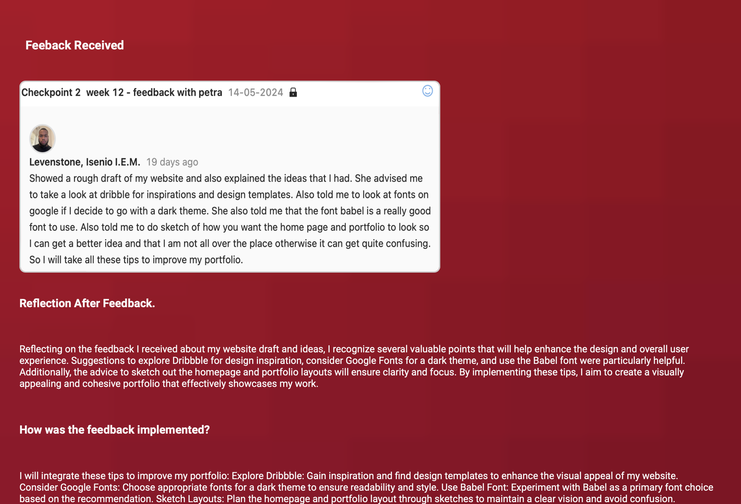
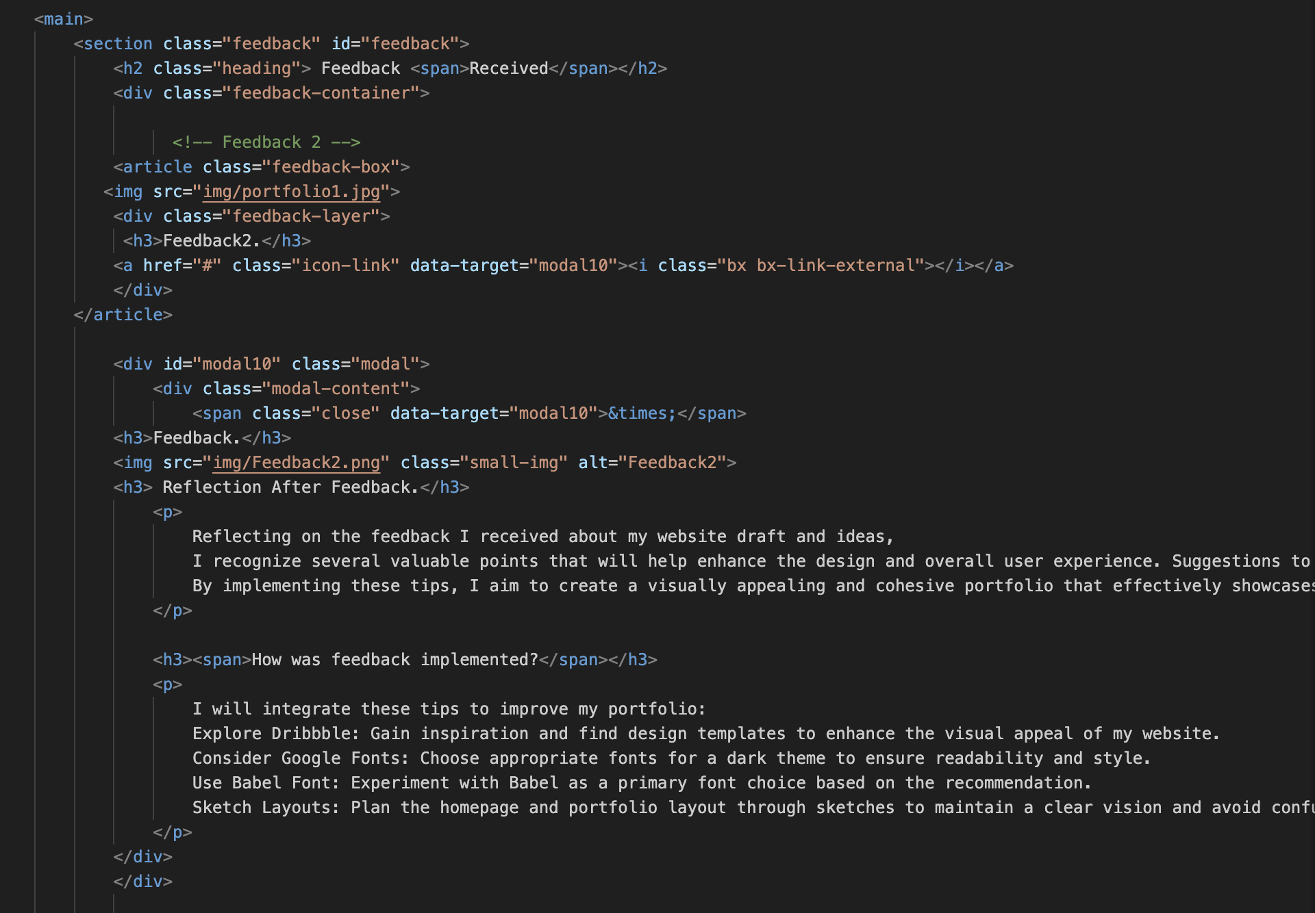
Feedback Received
×
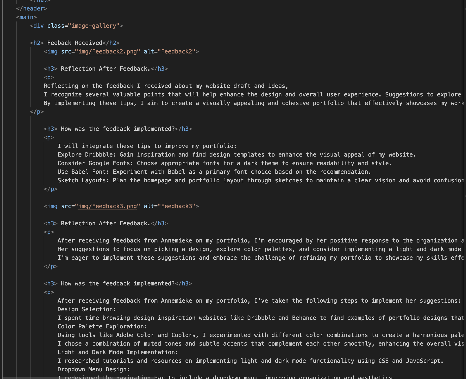
Feedback.
Reflection After Feedback.
Reflecting on the feedback I received about my website draft and ideas, I recognize several valuable points that will help enhance the design and overall user experience. Suggestions to explore Dribbble for design inspiration, consider Google Fonts for a dark theme, and use the Babel font were particularly helpful. Additionally, the advice to sketch out the homepage and portfolio layouts will ensure clarity and focus. By implementing these tips, I aim to create a visually appealing and cohesive portfolio that effectively showcases my work.
How was feedback implemented?
I will integrate these tips to improve my portfolio: Explore Dribbble: Gain inspiration and find design templates to enhance the visual appeal of my website. Consider Google Fonts: Choose appropriate fonts for a dark theme to ensure readability and style. Use Babel Font: Experiment with Babel as a primary font choice based on the recommendation. Sketch Layouts: Plan the homepage and portfolio layout through sketches to maintain a clear vision and avoid confusion.
×
Feedback.
Reflection After Feedback.
After receiving feedback from Annemieke on my portfolio, I'm encouraged by her positive response to the organization and clarity of my work. Her suggestions to focus on picking a design, explore color palettes, and consider implementing a light and dark mode are valuable insights that will elevate the visual appeal and functionality of my portfolio. Additionally, her advice to opt for a dropdown menu instead of cluttering the navigation bar adds a touch of sophistication to the user experience. I'm eager to implement these suggestions and embrace the challenge of refining my portfolio to showcase my skills effectively.
How was feedback implemented?
After receiving feedback from Annemieke on my portfolio, I've taken the following steps to implement her suggestions: Design Selection: I spent time browsing design inspiration websites like Dribbble and Behance to find examples of portfolio designs that resonated with my style and goals. Color Palette Exploration: Using tools like Adobe Color and Coolors, I experimented with different color combinations to create a harmonious palette for my portfolio. I chose a combination of muted tones and subtle accents that complement each other smoothly, enhancing the overall visual appeal of the design. Light and Dark Mode Implementation: I researched tutorials and resources on implementing light and dark mode functionality using CSS and JavaScript. Dropdown Menu Design: I redesigned the navigation bar to include a dropdown menu, improving organization and aesthetics.

×
Feedback.
Reflection After Feedback.
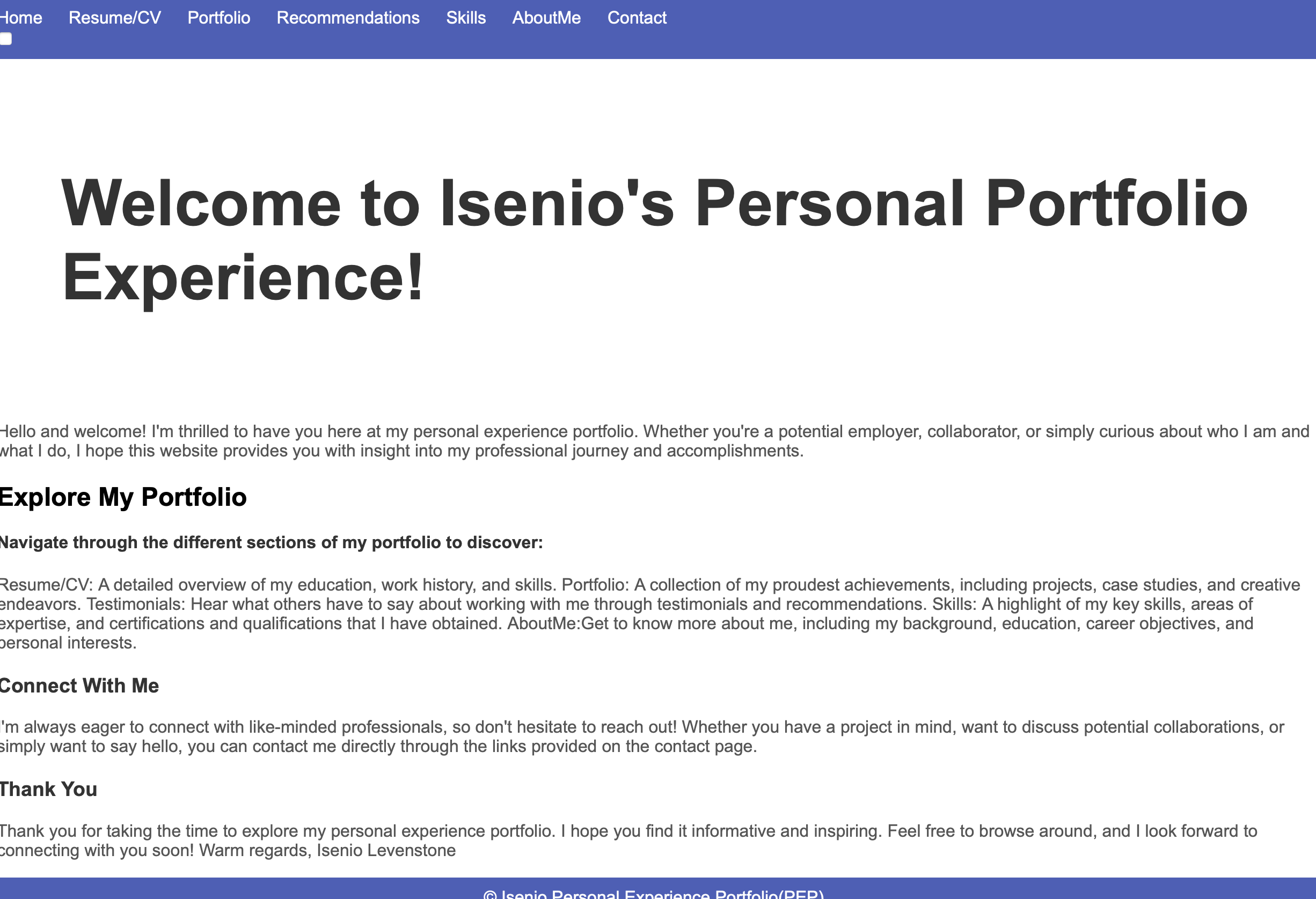
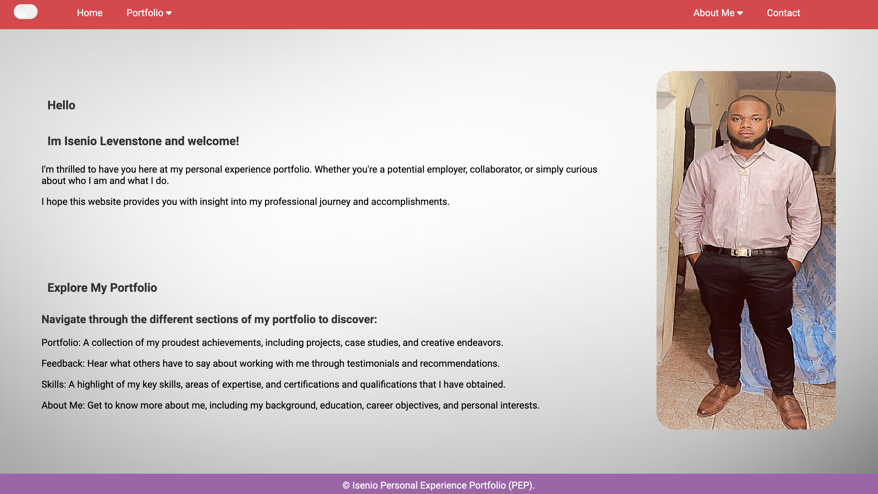
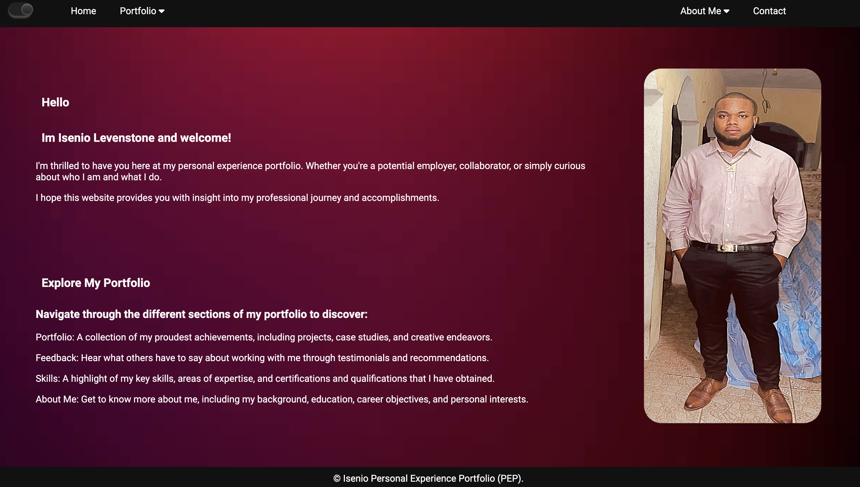
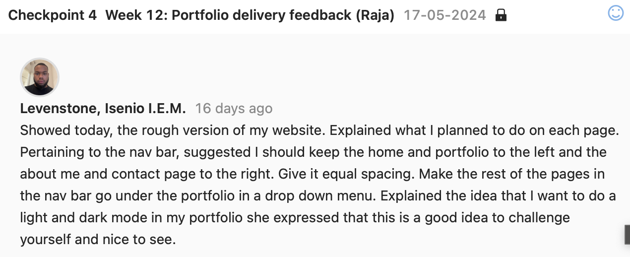
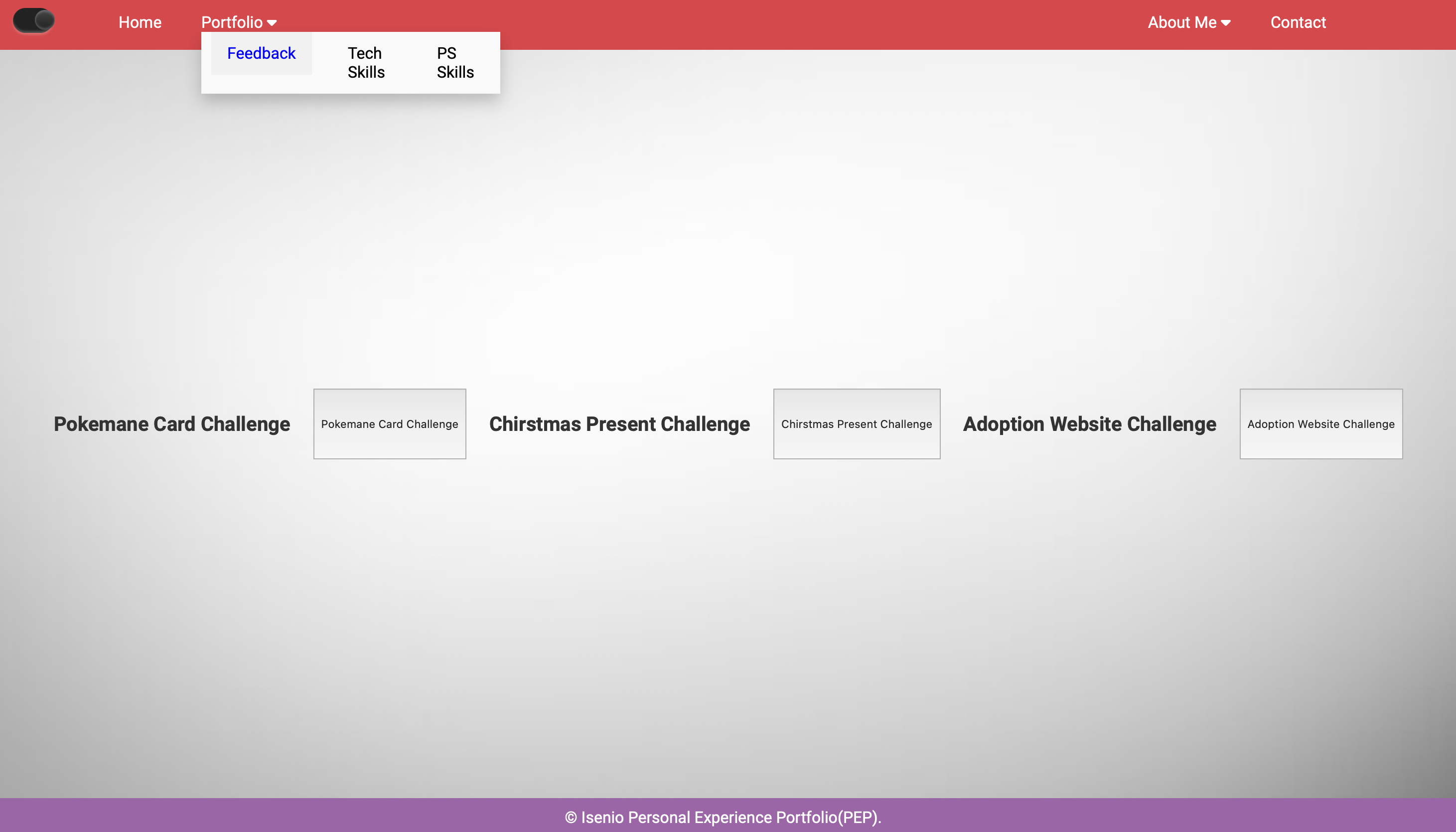
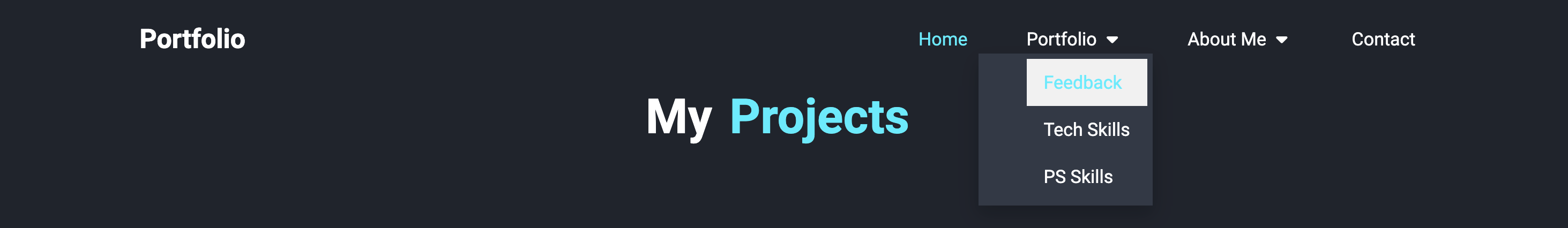
Today, I presented the rough version of my website and outlined the intended content for each page. Pertaining to the navigation bar, a suggestion was made to keep the "Home" and "Portfolio" links on the left, while placing the "About Me" and "Contact" links on the right. It was advised to give these items equal spacing for a balanced look. Additionally, it was recommended to place the remaining pages under the "Portfolio" link using a drop-down menu for a cleaner and more organized navigation experience. I also shared my idea of incorporating both light and dark modes into my portfolio, which was met with positive feedback. This challenge was seen as beneficial, adding a nice touch to the user experience. Overall, the feedback emphasized the importance of a well-organized and physically pleasing navigation structure, as well as the value of enhancing the website's usability with light and dark modes.
How was feedback implemented?
This feedback that was received was implemented into website: For the Navigation Bar: the "Home" and "Portfolio" was placed on the left, "About Me" and "Contact" on the right. A drop-down menu was added under "Portfolio" for other pages and also for for "About Me". Equal Spacing was also giving between links. A Light and Dark Mode was added. A Toggle Switch was also add in the HTML for theme switching. A JavaScript was encorporated through watching continuos tutorials to enable functionality between switching light and dark modes based on the toggle switch. This overall helped to enhance the look of the website.

×

Feedback.
Reflection After Feedback.
Today, I discussed my portfolio with a focus on the wireframe prototype, illustrating my vision for the website's layout and functionality. During the feedback session, it was suggested that I explore a broader range of color palettes to refine the light and dark modes of the site, enhancing its visual appeal and user experience. Additionally, I shared the technical challenge I faced with aligning the navigation bar headings using flexbox. Despite attempts to move items to the left, success was only achieved using margin adjustments. She acknowledged this issue and offered to send some helpful tips and tricks for better handling CSS and HTML, which will undoubtedly aid in resolving these layout concerns. Reflecting in this feedback, I recognize the value of diversifying my design elements, particularly in color selection, to create a more aesthetically pleasing interface. Furthermore, the promised guidance on CSS and HTML will be instrumental in overcoming current obstacles, allowing for a more polished and professional navigation bar implementation. This feedback not only provides actionable steps for improvement but also emphasizes the importance of continuous learning and adaptation in web design.
How was feedback implemented?
This feedback was implemented continous research on a variety of color palettes for both light and dark modes. I then applied the one i found was best suited for my website design to enhance the visual appeal. For the Navigation Bar Alignment: I reviewed the CSS and HTML tips provided to better understand flexbox properties. I Adjusted the navigation bar using these tips to properly align the headings without relying solely on margins. By incorporating these steps,I improved both the design and functionality of your portfolio website.

×
Feedback.
Reflection After Feedback.
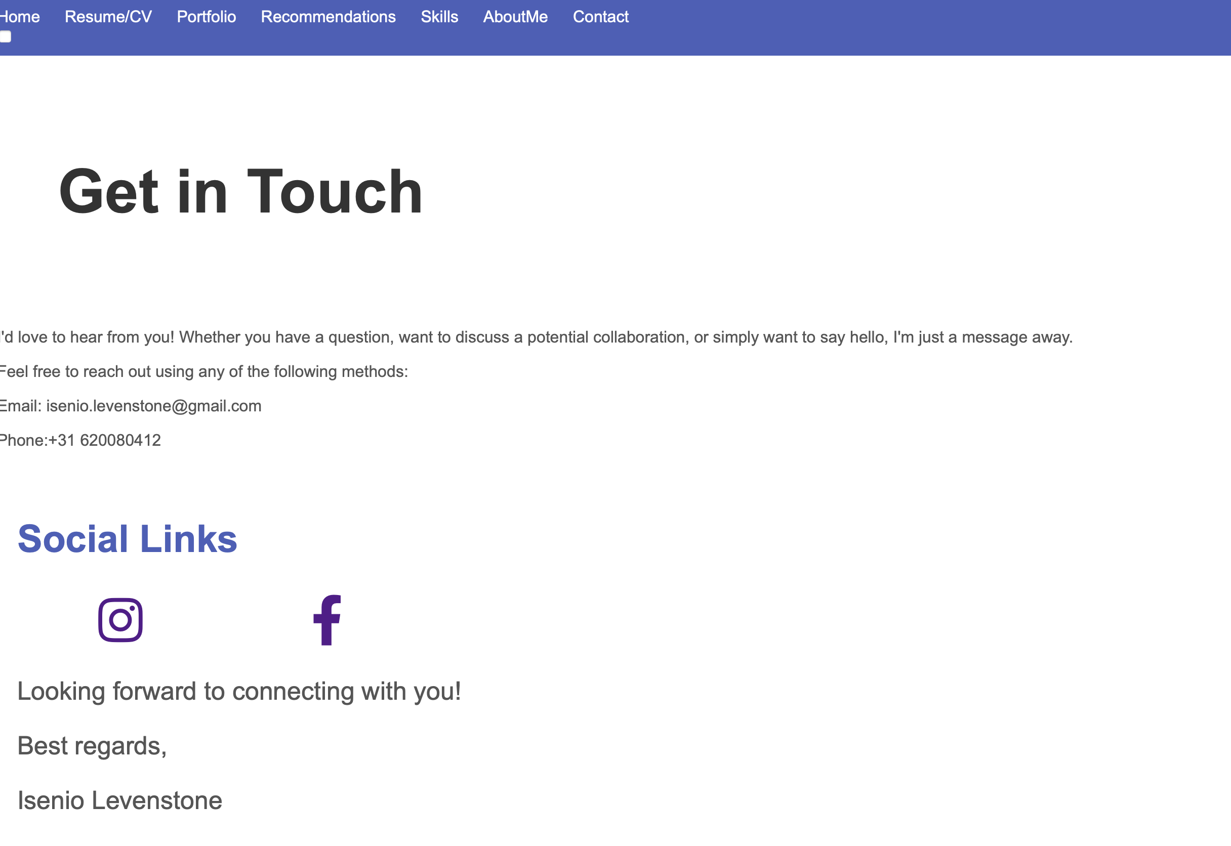
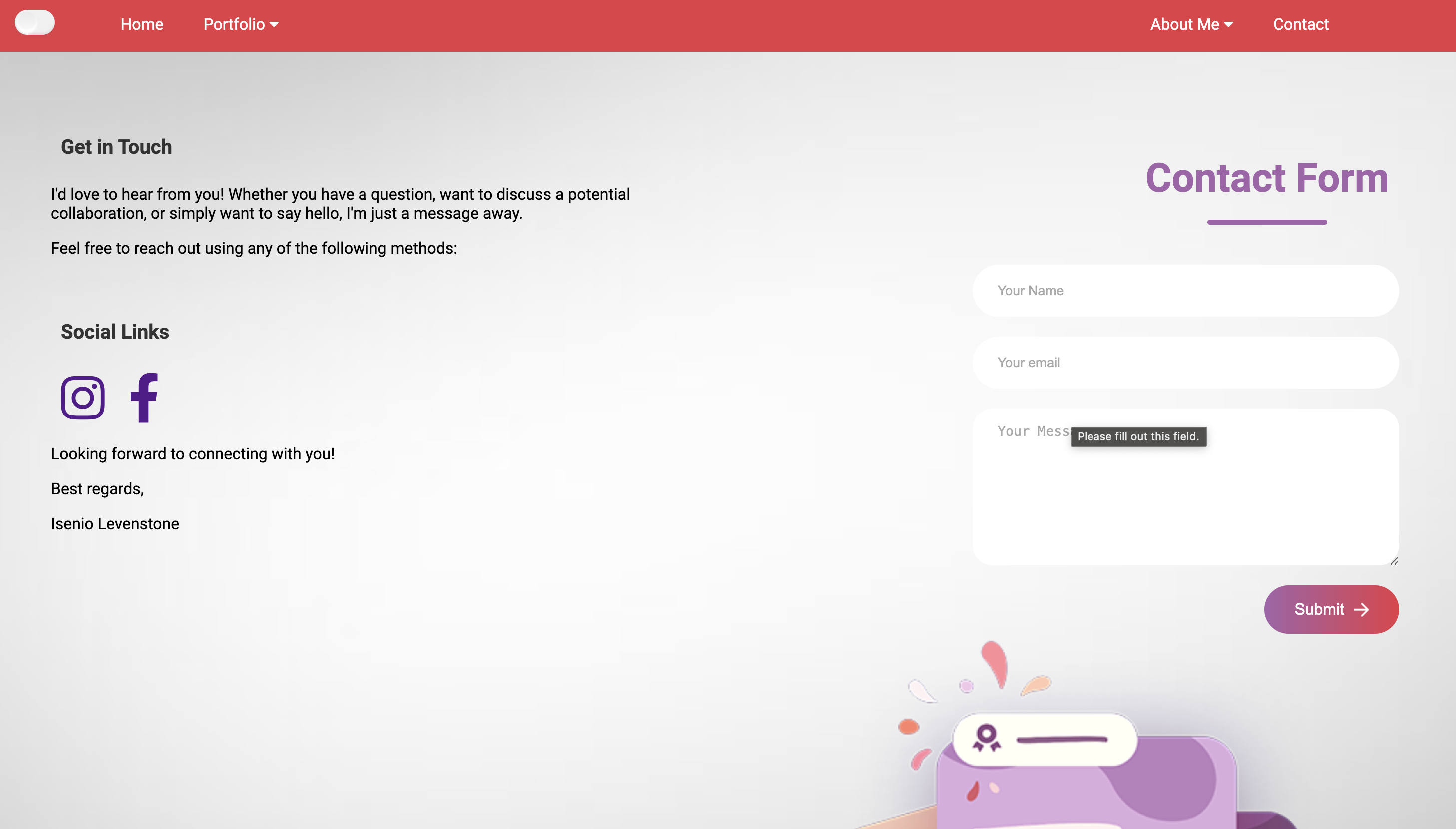
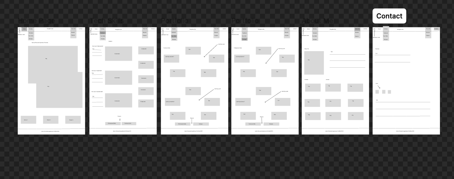
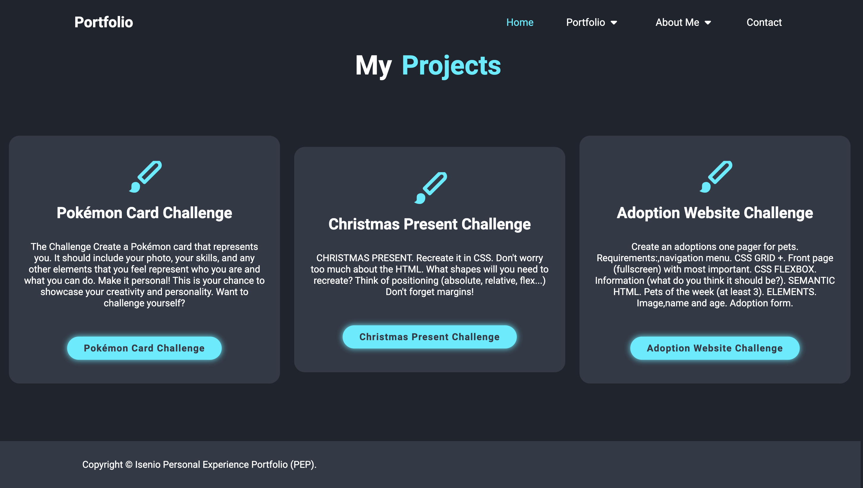
Today, I presented the wireframe prototype and the updated website for my portfolio. The feedback highlighted that the current wireframe is somewhat confusing and could become problematic for future design work. I was advised to refine the wireframe and create an interactive prototype, seeking feedback from technical teachers to ensure clarity and functionality. Regarding the updated portfolio, it was noted that the site appears empty and requires additional content. I need to enrich the pages with more detailed explanations of learning outcomes and enhance the design with more CSS styling. For the contact page, it was suggested to replace the email and phone number with a contact form, allowing users to reach out directly through the website. This feedback underscores the importance of iterative improvements and comprehensive input from multiple teachers to refine both the design and content of the portfolio. Moving forward, I will focus on making the necessary updates and seek further feedback to ensure the portfolio is both visually appealing and content-rich.
How was feedback implemented?
To implement this feedback received:I need to simplify and clarify the wireframe design. I need to seek feedback from technical teachers to ensure the design is functional and user-friendly. More Content will be added and has been added and CSS will continue to enhanced: Each page will be populated with detailed explanations of learning outcomes and relevant content. I am currently adding more CSS to enhance the visual appeal of the website, adding more styles and effects as needed. The Contact Page has been updated: I replaced the email and phone number with a contact form. I used HTML and a backend service called (Web3Forms) to handle form submissions. Pertaining to feedback, I still need to regularly present updates to all teachers and incorporate their suggestions to continuously improve the portfolio.
×
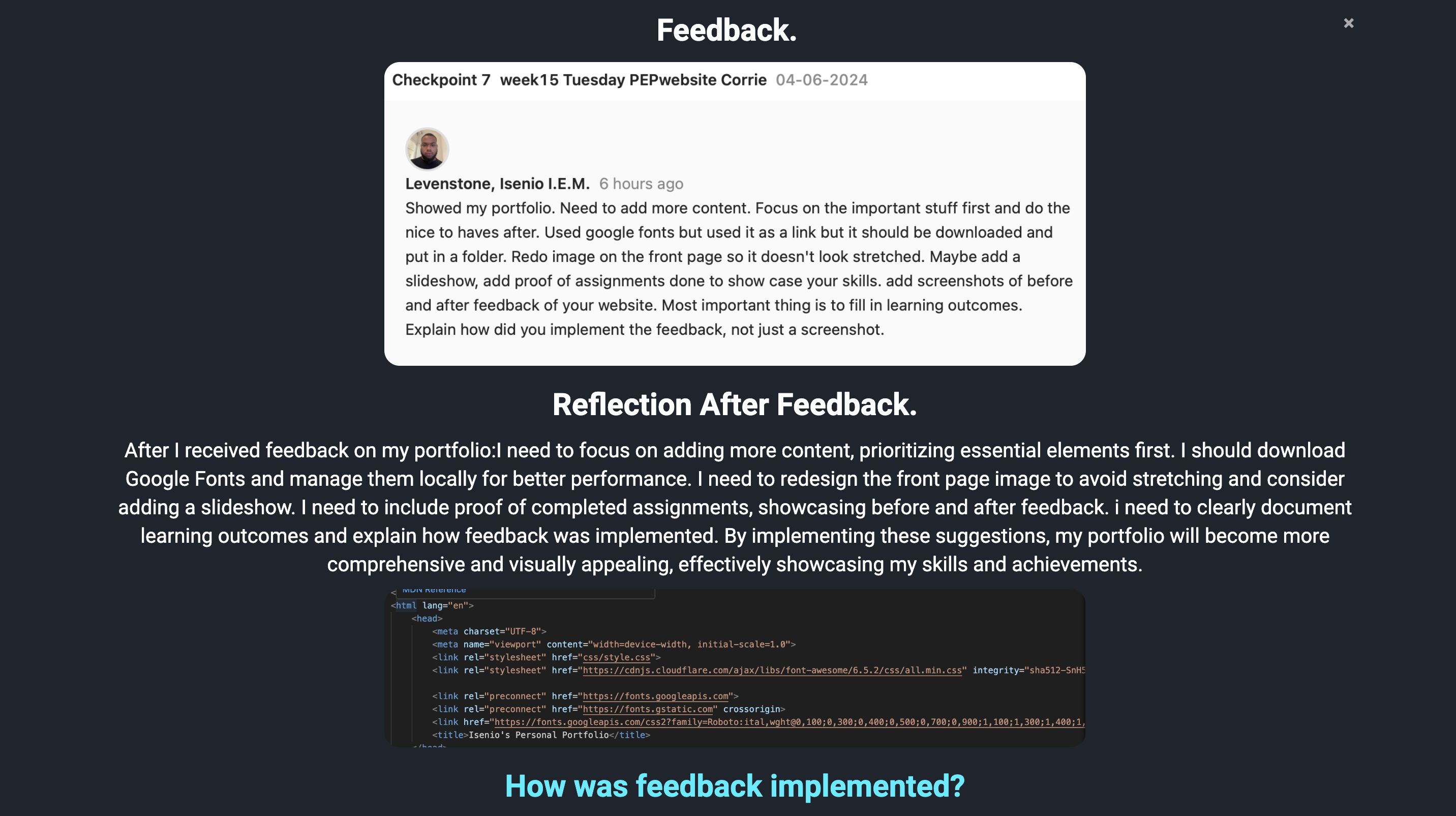
Feedback.
Reflection After Feedback.
After I received feedback on my portfolio:I need to focus on adding more content, prioritizing essential elements first. I should download Google Fonts and manage them locally for better performance. I need to redesign the front page image to avoid stretching and consider adding a slideshow. I need to include proof of completed assignments, showcasing before and after feedback. i need to clearly document learning outcomes and explain how feedback was implemented. By implementing these suggestions, my portfolio will become more comprehensive and visually appealing, effectively showcasing my skills and achievements.
How was feedback implemented?
To implement this feedback: I prioritize adding detailed content about key projects and skills. I began with essential information and progressively incorporated supplementary elements. For Font Management: I download Google Fonts and store them in a local folder within the project directory called fonts. I updated the CSS to reference the locally stored fonts instead of linking to them externally. For the Image Redesign:I replaced the stretched front page image with a properly sized one. I am considering integrating a slideshow feature to dynamically showcase project highlights. For Assignment Proof: I have added somde the challenges in the project page. I am in the process of gathering screenshots of assignments before and after receiving feedback. these will be organized to visually demonstrate growth and improvement. Learning Outcomes Documentation: I have started to clearly outline learning outcomes for each project or skill. By following these steps, my portfolio will continue to be enriched with compelling content, improved aesthetics, and enhanced documentation of learning and growth.
Reflection after Feedback
×
Feedback.
Reflection After Feedback.
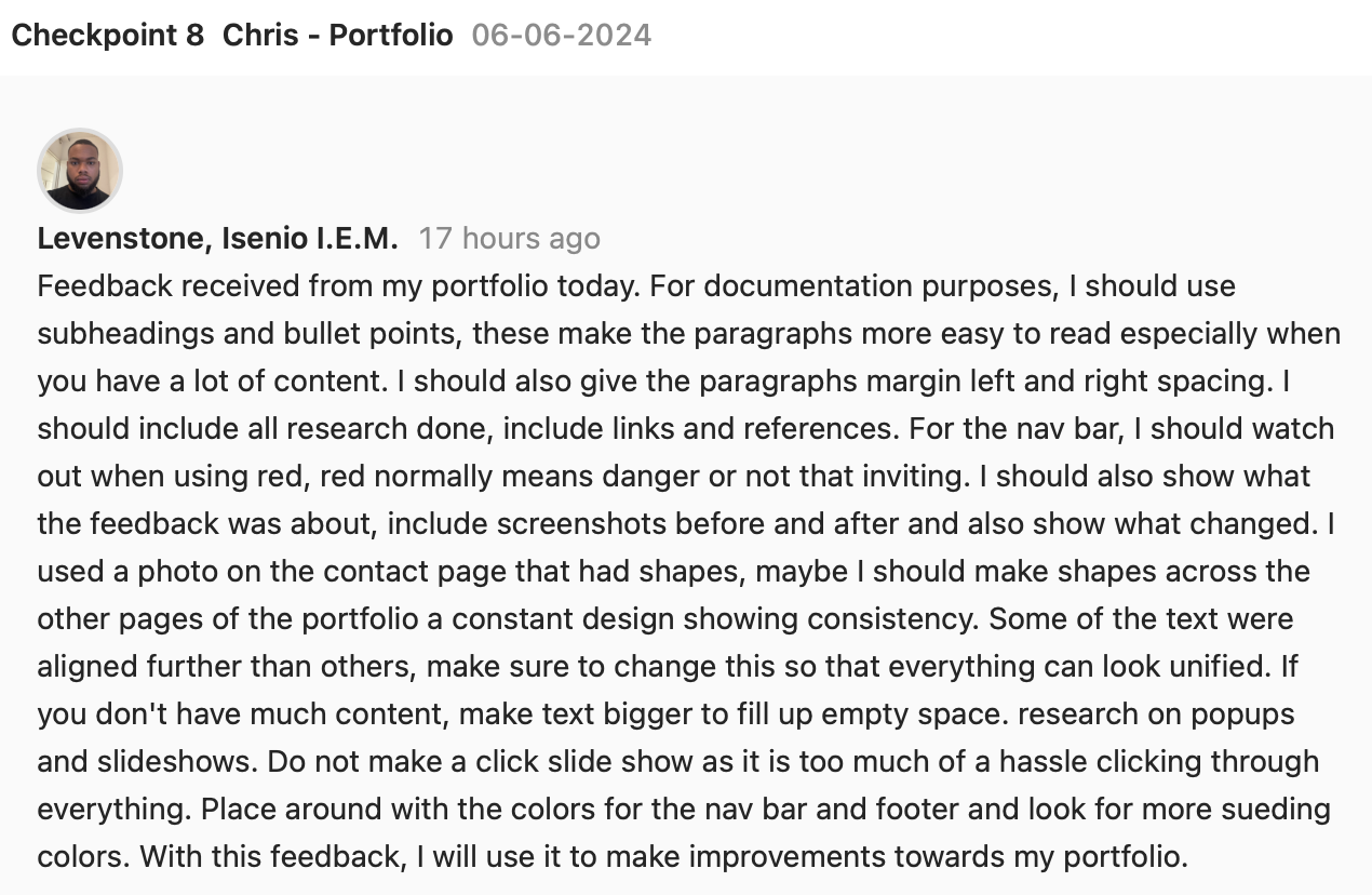
Today, I received valuable feedback on my portfolio. I was advised to use subheadings and bullet points for better readability, and to add left and right margins to paragraphs. Including all research with links and references was also recommended. For the nav bar, I should be cautious with red as it can imply danger. To show changes, I need to include before-and-after screenshots and describe the feedback. Maintaining design consistency with shapes across all pages was suggested, and I should ensure text alignment for a unified look. To fill empty space, enlarging the text is a good strategy. Additionally, I need to research popups and slideshows, avoiding click-through slideshows. Lastly, experimenting with colors for the nav bar and footer to find more suitable options was recommended. I will use this feedback to enhance my portfolio.
How was feedback implemented?
After receiving and reflecting on this feedback. I decided to implemnt and change these necesary information. I used subheadings and added paragraph margins. I avoided use red in general in my new design website as it is not that inviting at times. I have started to show before/after screenshots and changes made. I made sure that my design was consitent throughout the pages and eliminated the shapes across pages. Increase text size to fill empty space and top show hierachy. Also did research on popups/slideshows and have decided to implement some popups in my porfolio.

Reflection after Feedback
×
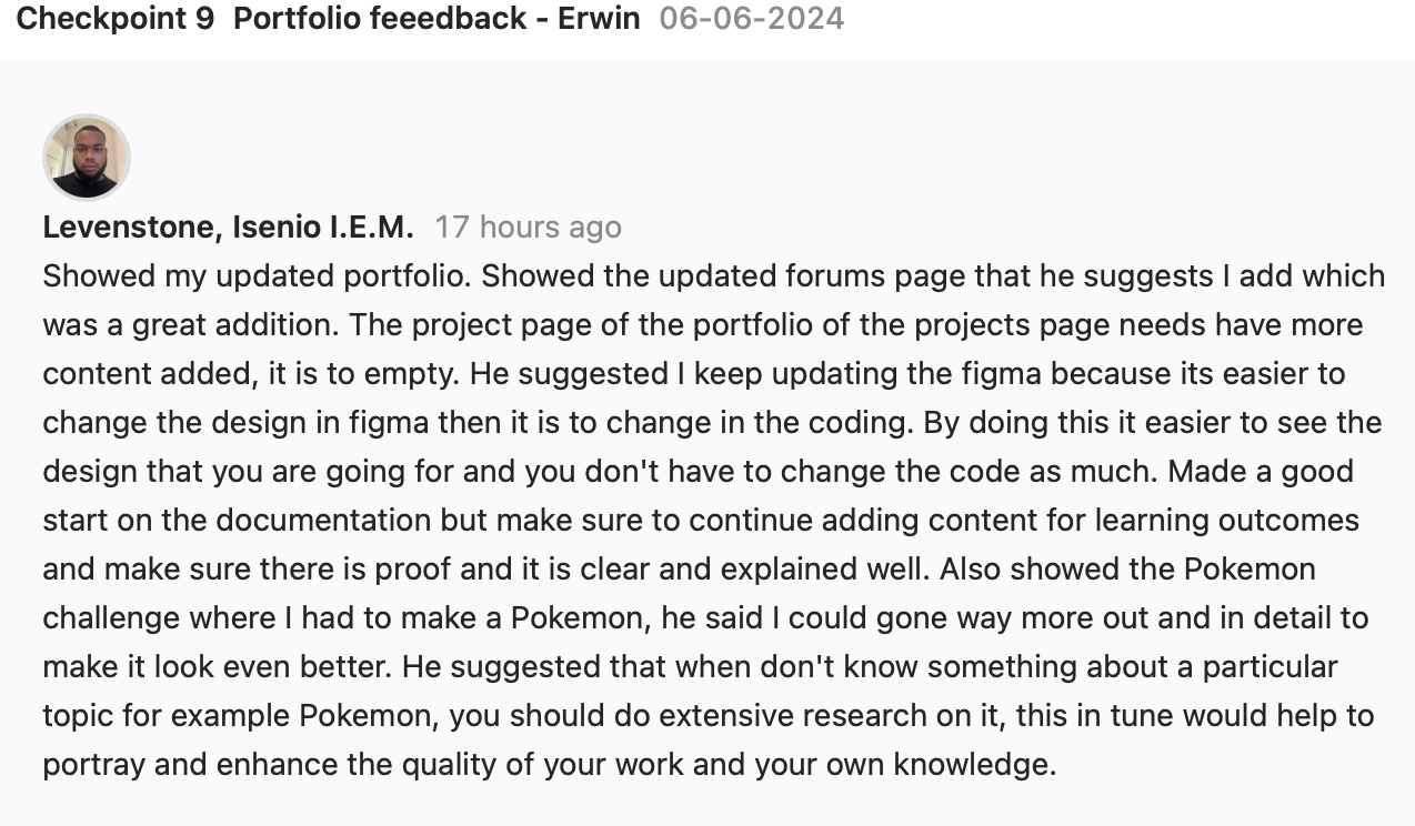
Feedback.
Reflection After Feedback
I presented my updated portfolio and the new forums page, which was a great addition. For the project page, I need to add more content as it is currently too empty. It was suggested to keep updating the design in Figma, as it's easier to make changes there before coding. The documentation has a good start but needs more detailed content on learning outcomes, with clear explanations and proof. Regarding the Pokémon challenge, I was advised to add more detail to improve its quality. Additionally, I should conduct extensive research on unfamiliar topics to enhance my work and knowledge.
How was feedback implemented?
After the reflection on the feedback receivied I updated the Project Page:Added icons and stling for each project to make it look more appealing and to fill the empty space on the page. Use images, descriptions, and outcomes to enrich the page. I started to provide more detailed content on learning outcomes. Include proof such as screenshots, certificates, or testimonials.
Reflection after Feedback
×
Feedback.
Reflection After Feedback
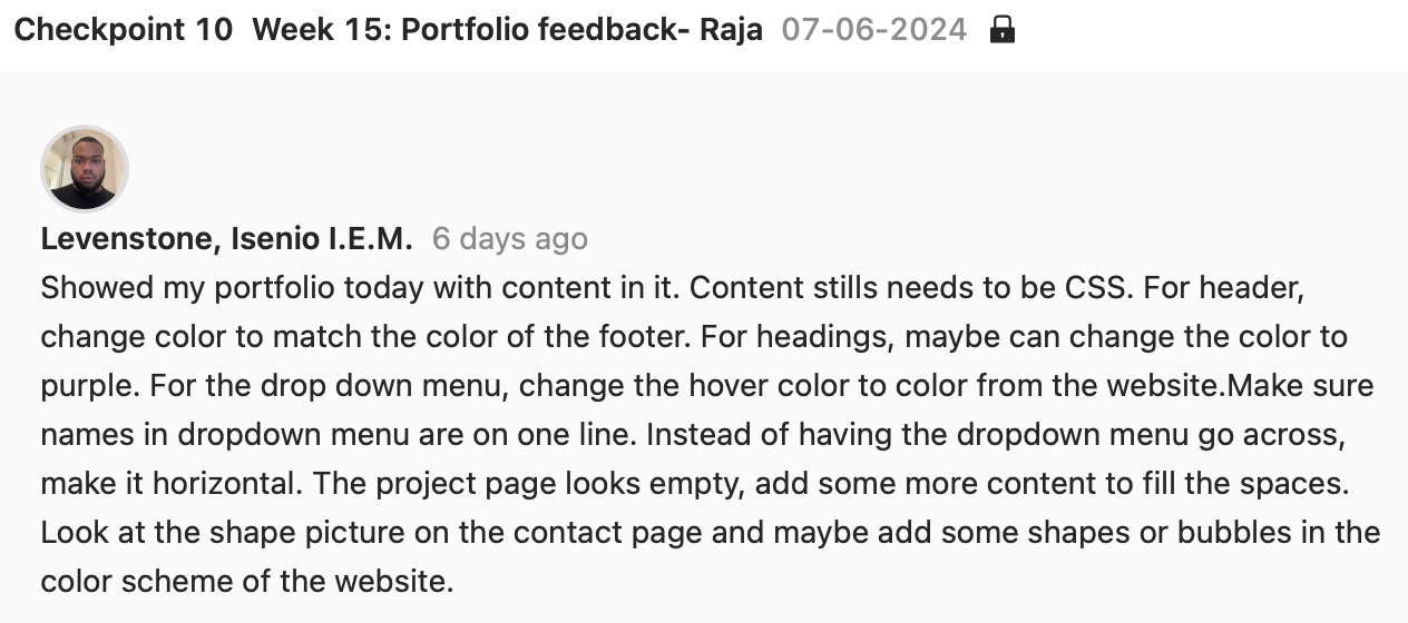
Today, I presented my portfolio with added content. Here are some tips I should consider after the feedback. I should Ensure all content is styled with CSS for consistency. I should consider Changing the header color to match the footer. For the Dropdown Menu: Change hover color to one from the website's palette. Ensure names in the dropdown are on one line. Make the dropdown menu horizontal instead of vertical.
How was feedback implemented?
I have implemented and change header and foot color to be the same Color For the Dropdown Menu: I have changed hover color to match the sign of the website. I ensured text alignment for names and also changed the text alignment from vertical to be horizontal.
×
Feedback.
Reflection After Feedback
Today, I received feedback on my portfolio. The key points I took away is that I had to seek out more inspiration.
Look at more designs and current trends for inspiration.
Enhance Design: Make the design cooler and more interesting.
Headings Order: Ensure headings follow the correct hierarchy starting from.
Visual Appeal: Use more colors and make the design visually engaging.
Incorporate trends and dynamic elements to make the portfolio more eye-catching and attractive.
How was feedback implemented?
After reflecting on this feedback on your portfolio, I seeked Inspiration on Dribbble and Behance, looked at some Personal experience portfolios. Save some examples of designs and elements that caught my eye. I also enhanced and changed the whole design. I elimated the dark and light mode and when with one dark theme. Tried to maKe it Cool and Interesting with javascript and css. Focused on creating a unique and modern look. Also rearranged my heading tags to go in order.
×
Feedback.
Reflection After Feedback
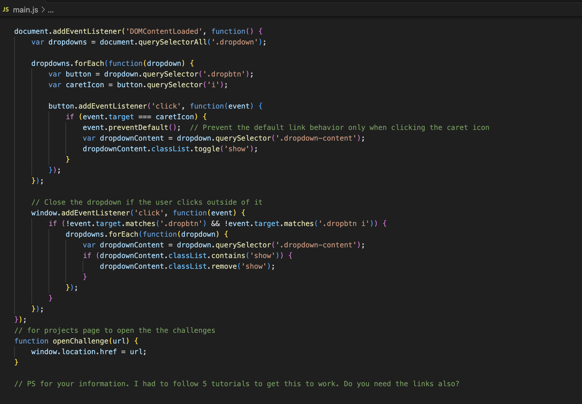
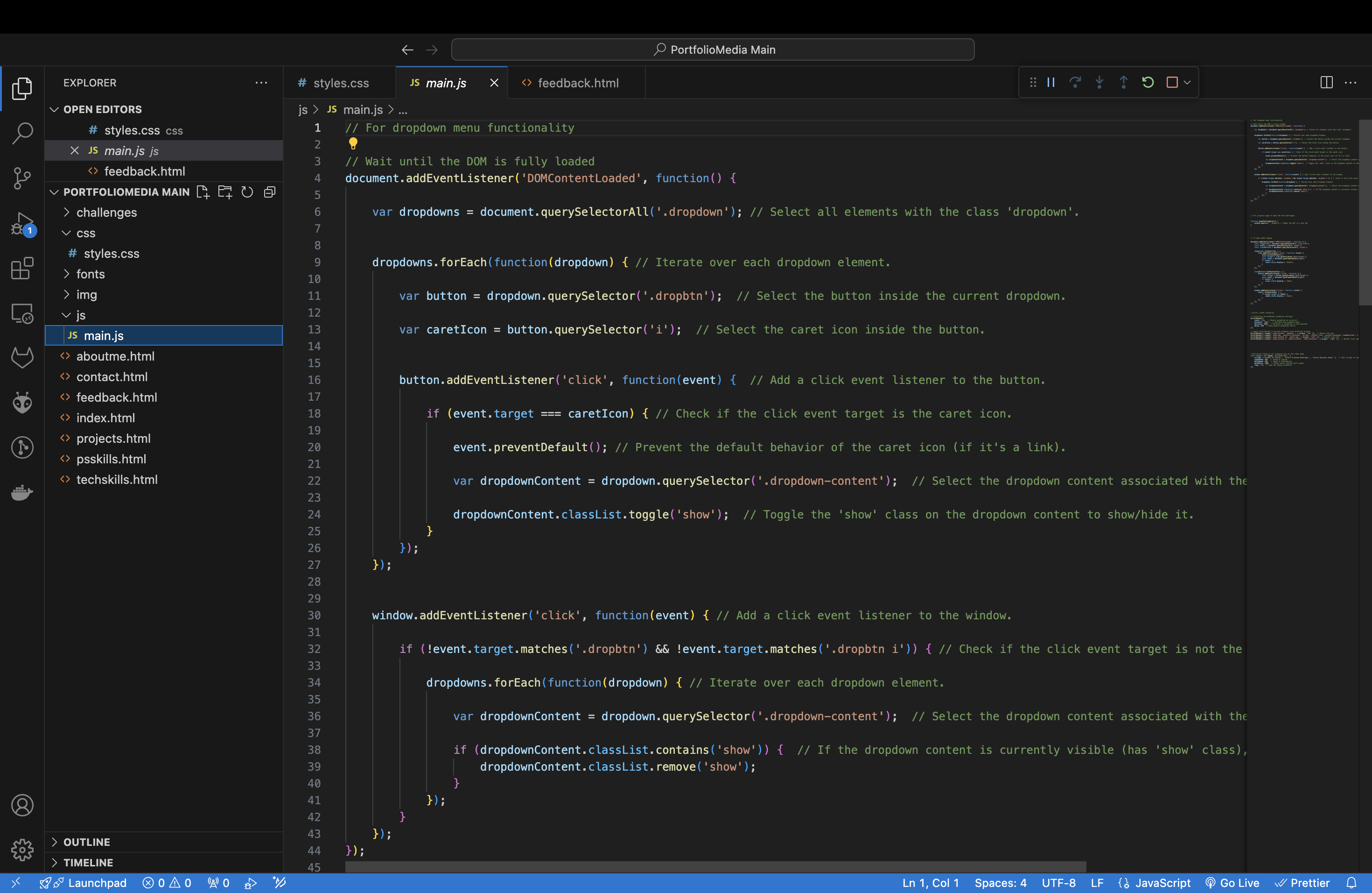
Reflecting on this feedback, itemphasizes the need for clearer code comments, better use of semantic HTML elements, proper image sizing, and thorough documentation with evidence such as videos and screenshots.
How was feedback implemented?
I implemented this feedback by Code Commenting: Added comments to theJavaScript code explaining what each line or block does. Semantic Elements: I used semantic HTML elements like " heade>, footer, article, and section" to structure my content more meaningfully. Image Sizing: Specified the dimensions for images using CSS or HTML attributes to ensure they display correctly. This helps maintain a consistent layout and improves page load times. Documentation and Proof: I included screenshots and other evidence to demonstrate my work.
×
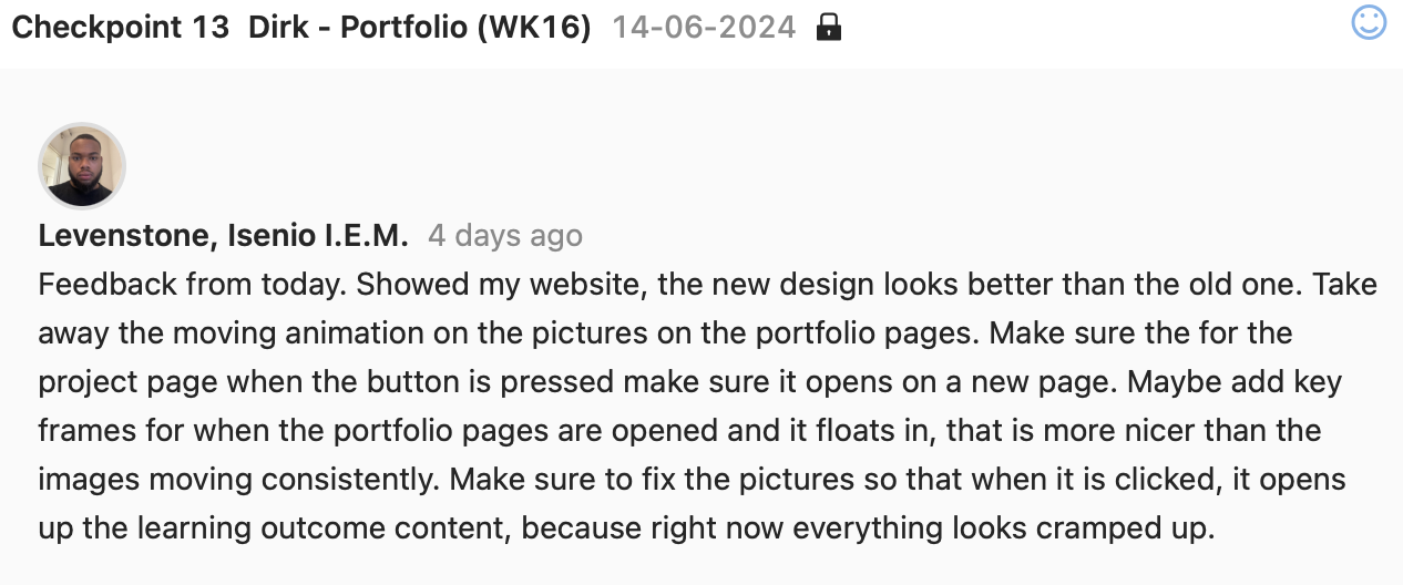
Feedback.
Reflection After Feedback
Today's feedback on the website redesign was insightful and constructive. The new design was generally well-received, noted for its improvement over the previous version. However, there are a few key areas for enhancement: Remove Animation on Portfolio Pictures: The moving animation on the portfolio images was distracting, and its removal is recommended for a cleaner, more professional look. Project Page Button Behavior: Ensure that when the project page button is clicked, it opens in a new tab for better user navigation. Key Frames for Portfolio Pages: Consider adding key frames for the opening animation of portfolio pages, providing a smoother and more appealing transition. Picture Click Functionality: Adjust the images so that clicking on them reveals the learning outcome content. Currently, the layout appears cramped, and this change should improve clarity and user experience.
How was feedback implemented?
To implement the feedback received, I removed the animation on Portfolio Pictures: but left it on the home and about page because of personal preference. I imlemented that when the button is pressed on the project page, it opens in a New Tab. I also ensured that each image in the portfolio has an associated click event to reveal content. I used JavaScript to handle the click event, modifying the DOM to display the learning outcomes. I also implemented that when the portfolio pages are opened; they float in to match the rest of the animations in my website.
×
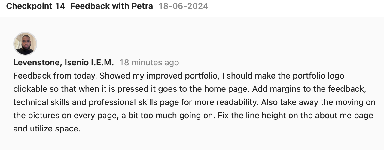
Feedback.
Reflection After Feedback
Today's feedback on my portfolio was quite insightful and pointed out several areas for improvement. Firstly, making the portfolio logo clickable to return to the home page is a great usability enhancement that I overlooked. This simple navigation feature will improve the user experience significantly. Additionally, adding margins to the feedback, technical skills, and professional skills pages will enhance readability by preventing text from appearing too cramped. Another important point was to remove the moving effects on pictures across every page, as it was deemed excessive and potentially distracting. Simplifying these elements will create a cleaner and more professional look. Lastly, fixing the line height on the about me page and better utilizing space will make the content more legible and visually appealing.
How was feedback implemented?
I implemented the feedback by making the Portfolio Logo Clickable. This change ensures that when users click on the logo, they are redirected to the home page. I added Margins for Readability to the portfolo pages. This prevented the text from appearing too cramped and improve readability. I also removed moving animations on pictures as this was a big distraction. I also fixed the line height on the about me page and utilized more space.
×

Feedback.
Reflection After Feedback
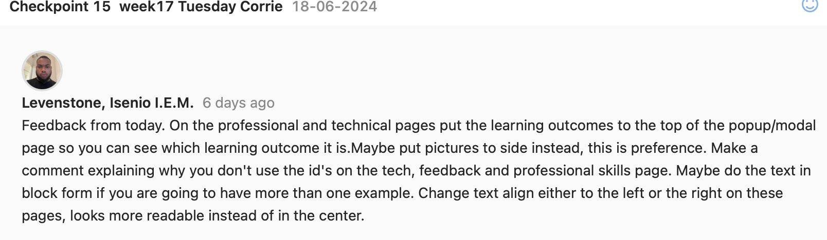
Based on today's feedback, I should prioritize placing learning outcomes at the top of the popup/modal page on professional and technical pages. Additionally, I should consider placing pictures to the side for better preference alignment. Regarding the use of IDs on the tech, feedback, and professional skills page, a comment should be placed explaining why it is used would be helpful. When presenting multiple examples, I should consider using block text formatting. Lastly, I should adjust text alignment to either left or right for improved readability on these pages, avoiding center alignment.
How was feedback implemented?
I have implemented some of this feedback ensuring the learning outcomes are displayed prominently at the top of each modal pop up. I have provided a comment explaining why the id's are currently not being used for the modals. i have assess the current text alignment (centered) on the pages in question. and I have adjusted text alignment to left instead, based on readability principles and user feedback.